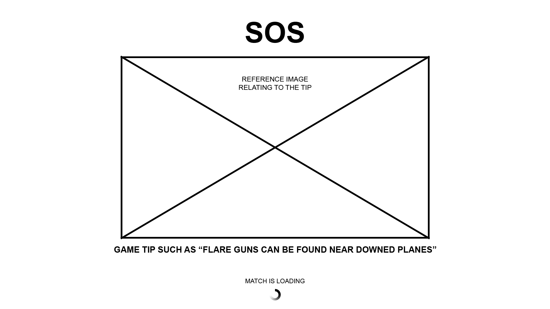
SOS : PC GAME
ROLE: UI/UX, Concept Design, Motion, 3D
USED: Unreal, AfterEffects, Cinema4D, Photoshop
SOS is an Unreal Engine PC Battle Royale-esque game released in Early Access on Steam in January 2018. I worked as the sole UI Designer in collaboration with the creative director to create branding, ui, menu designs and flow documents, in-engine implementations, and animations.
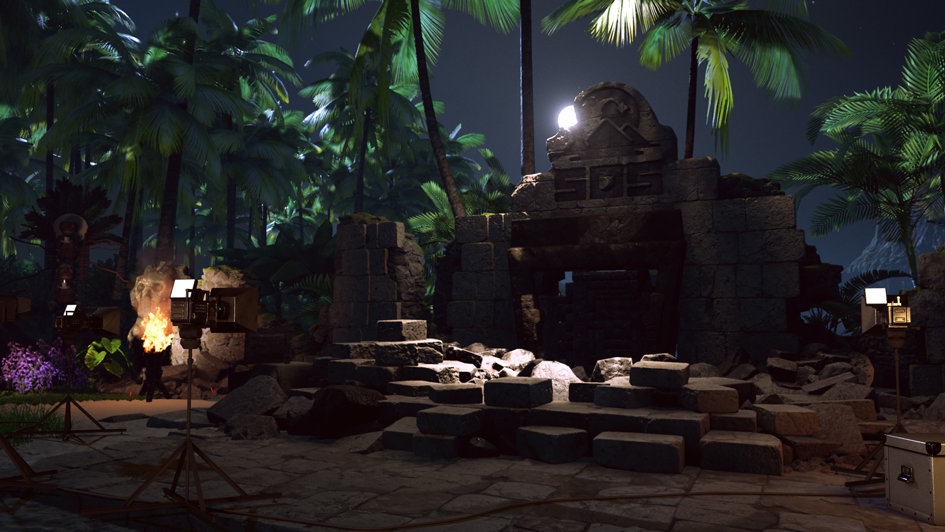
For the first year I worked on SOS, the game was set in a fictional anachronistic dystopian 1980's before the story was changed to be a current date reality TV Show. The original style was a fictional 1980's with themes of sci-fi futurism as seen through the lens of sci-fi films created in the 1980's. A sort of retro-futurism. The game's plot is that a semi-evil overlord corporation called Amarant rules most of the world and is run by a shadowy leadership that has prolonged their life indefinitely through the use of a crystalized tree sap harvested from a tropical island called La Cuna.
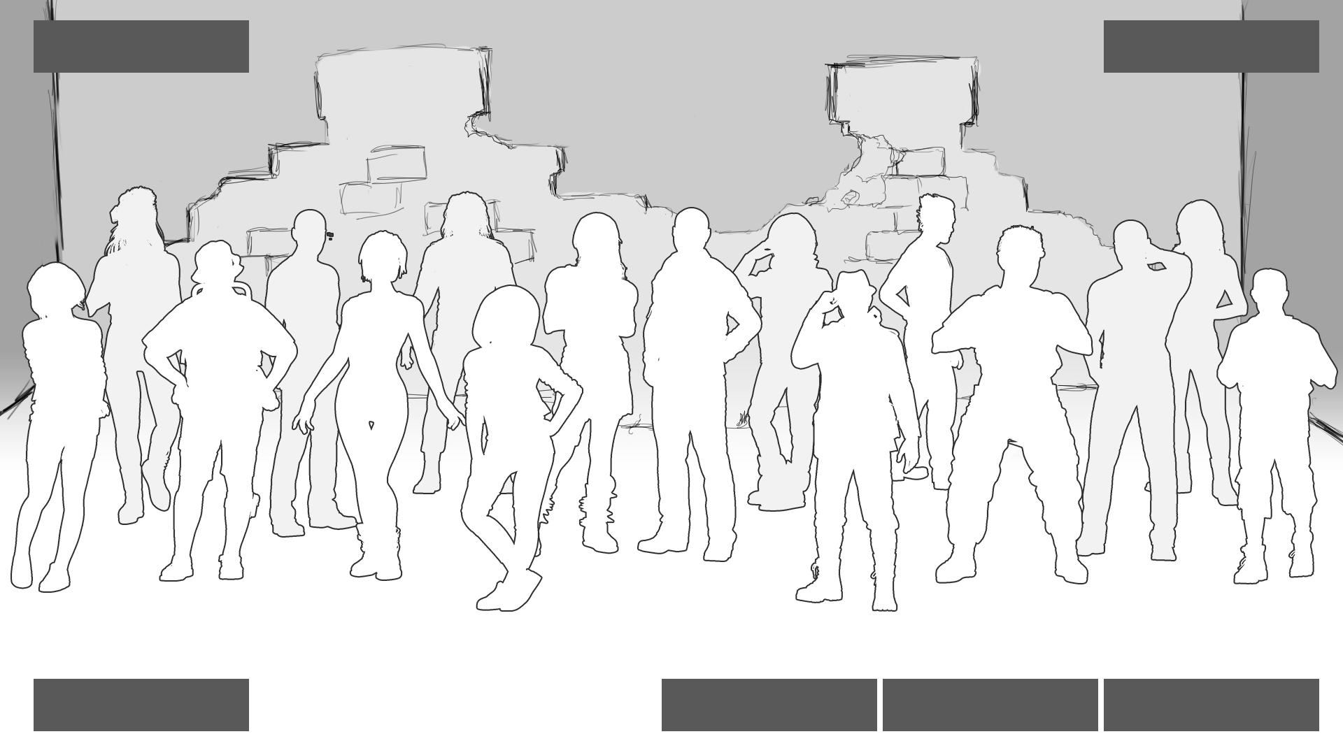
In the game, you were one of a dozen or so prisoners, airdropped onto the dangerous island. La Cuna had been attempted to be colonized but failed due to the indigenous and extremely deadly creatures. As the player you must find one of three crystal sap artifacts, fire a flare, and extract from the island. You could go it alone, kill other players, or create uneasy alliances and work together to escape. All while the game is, in-fiction and out of fiction, televised to the world. In the real world, using Twitch.tv and Outpost's own platform known as Hero, the game would be broadcast and the players could see how many viewers they had and the viewers reactions to your gameplay. Periodically there would be world events that were voted upon by the viewers to either hinder or help the players.
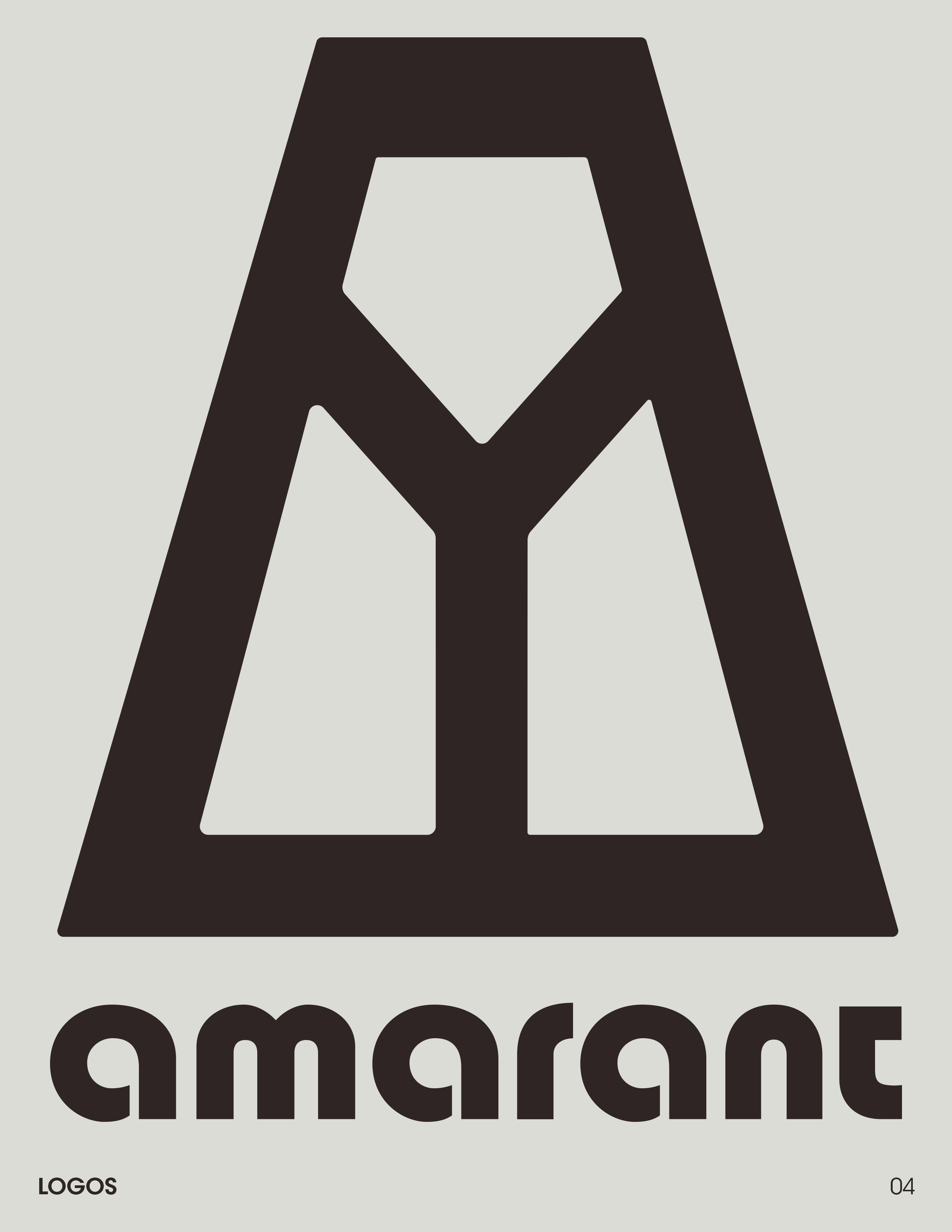
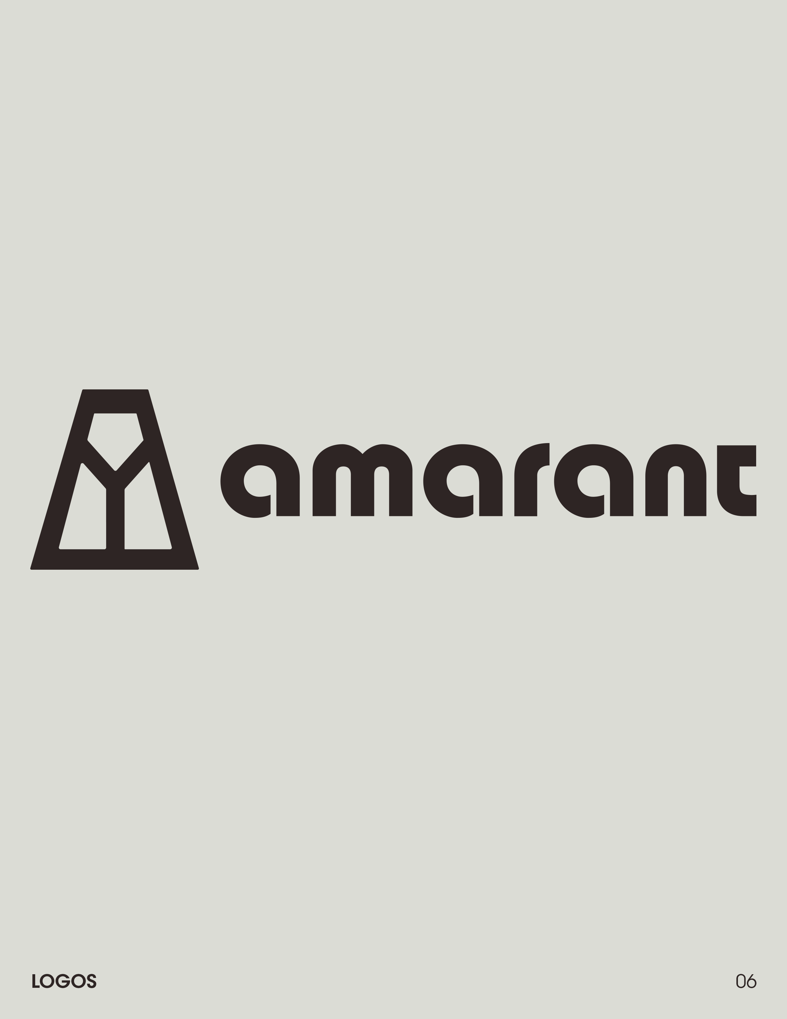
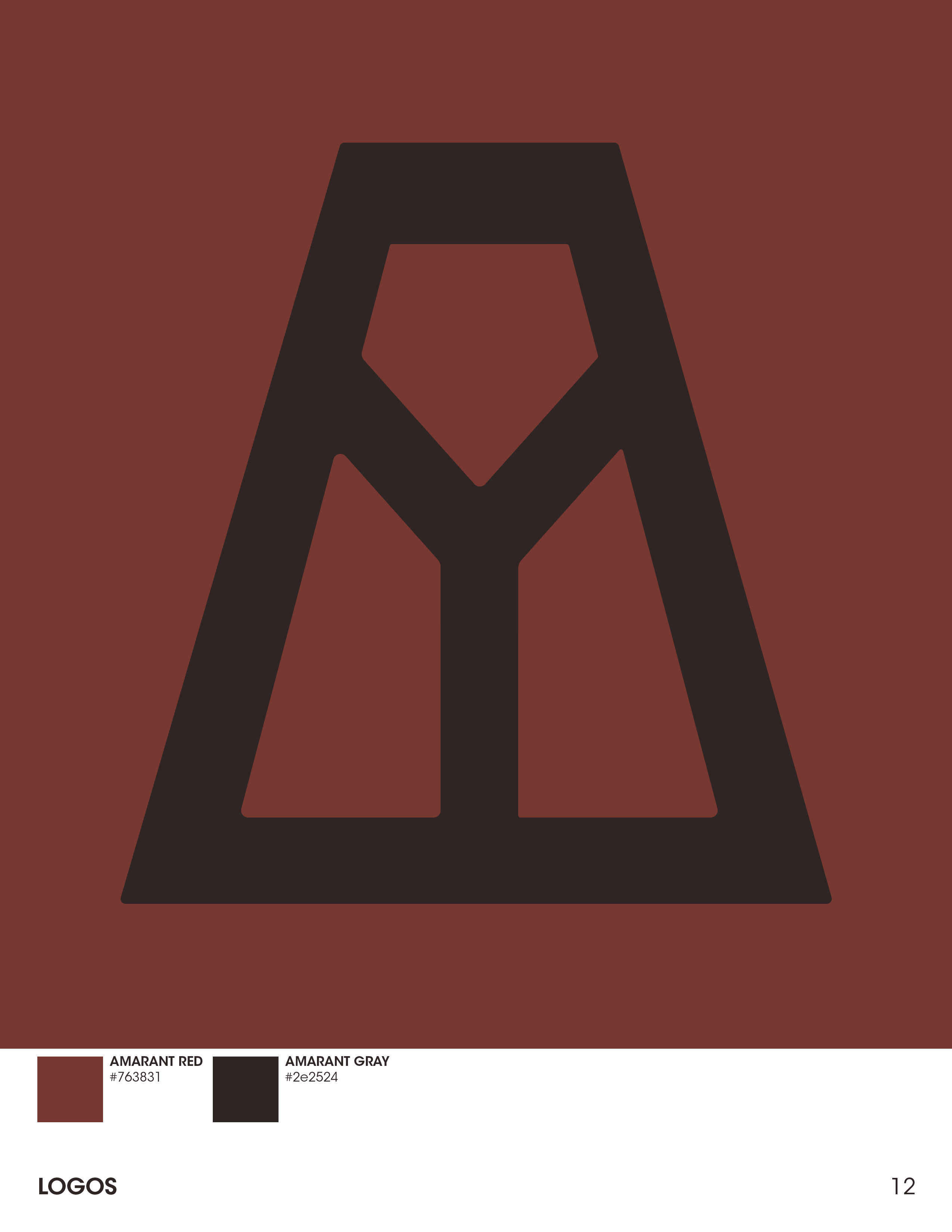
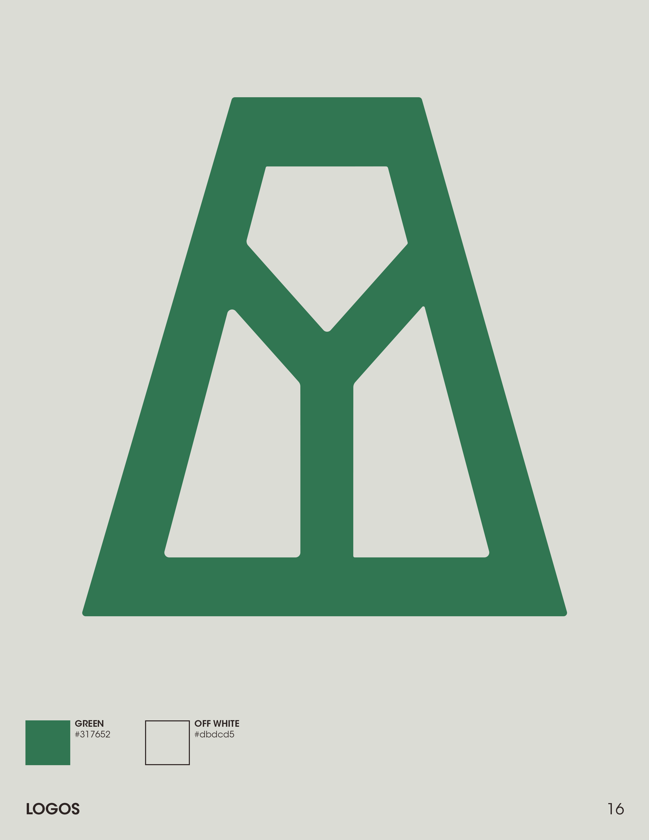
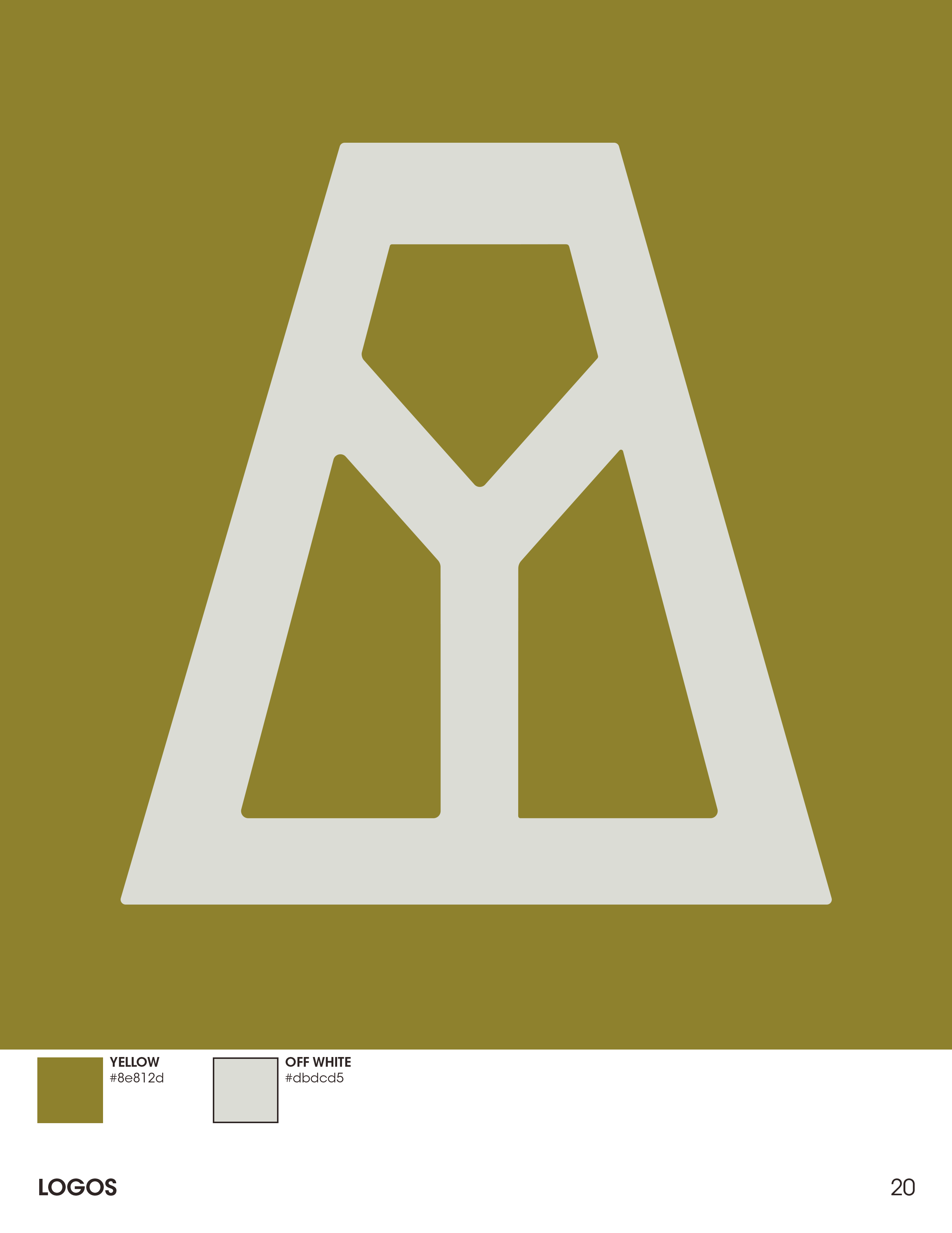
AMARANT
I worked with the creative director, Ben Wanat, to create the in-fiction corporations branding. I wanted to evoke 80's branding without going kitsch. I looked at 80's TV commercials, packaging designs, iconography and branding created in the 80's, movie trailers, and movie studio bumpers.
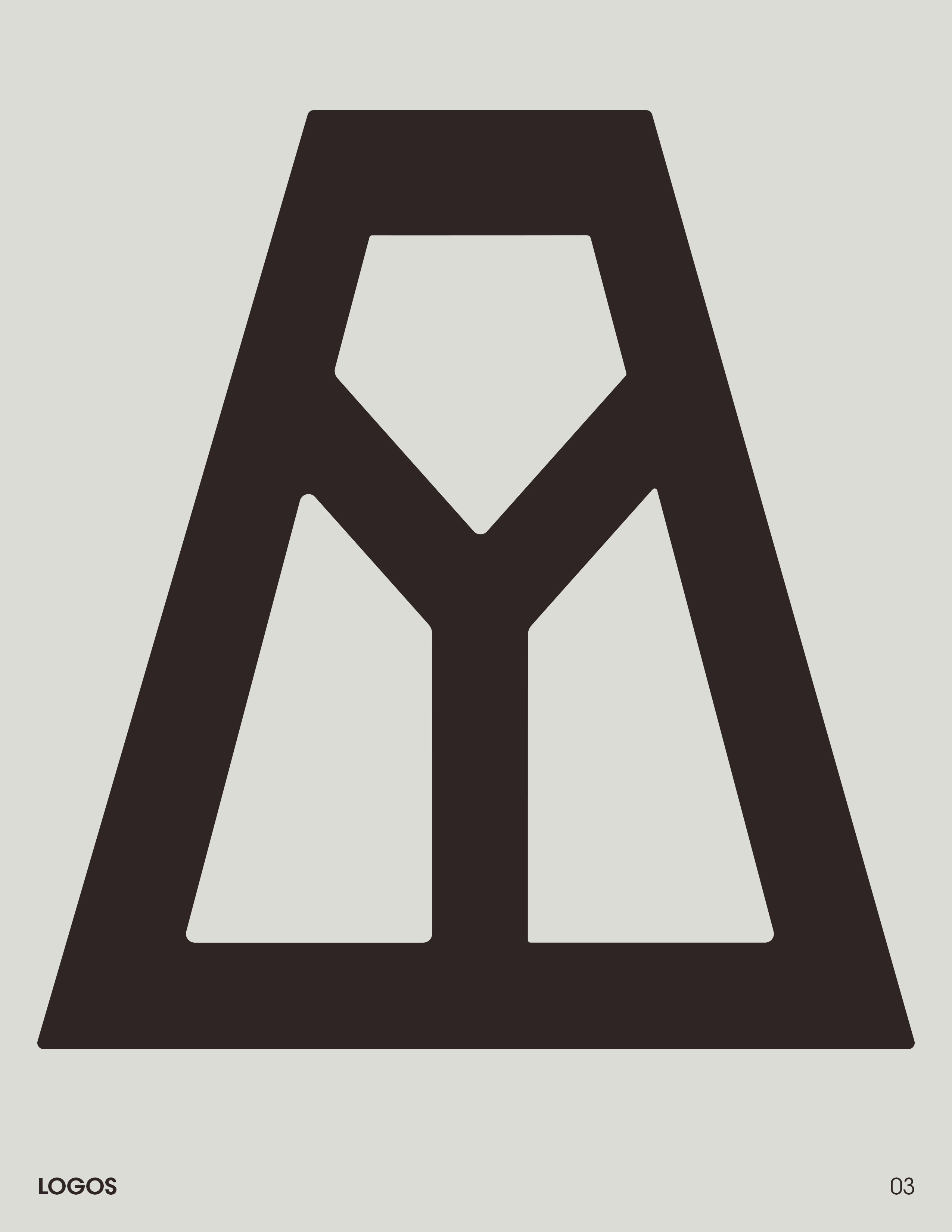
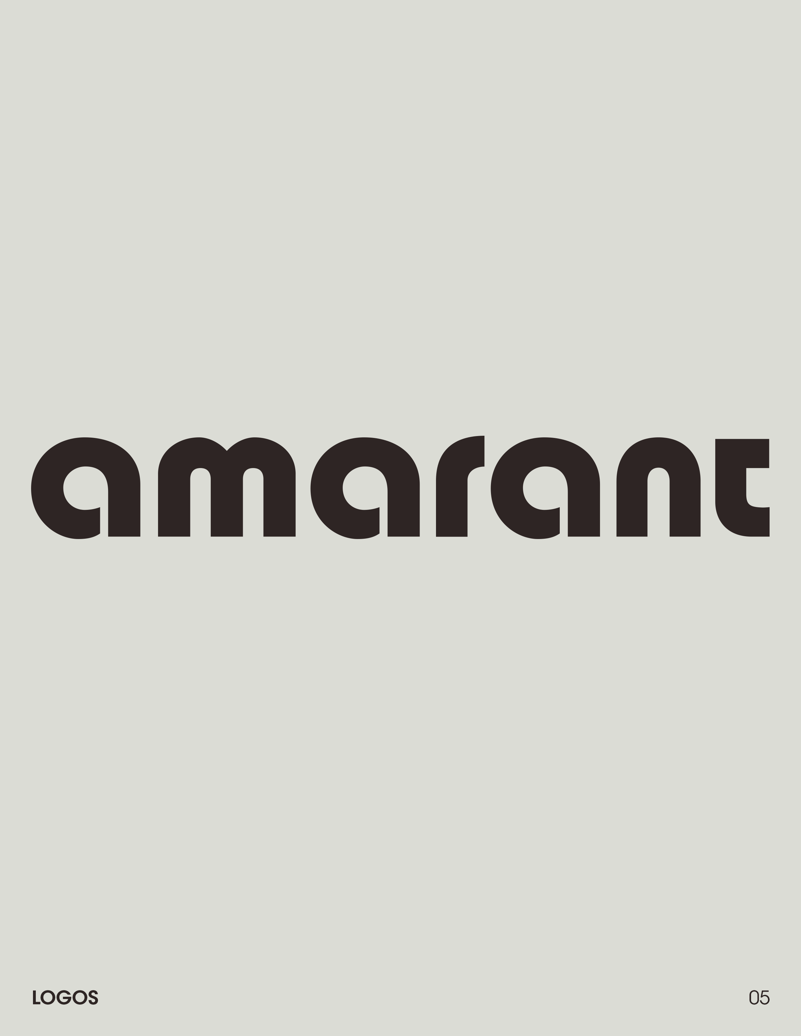
I started by refining the Amarant icon that Ben had created then made a wordmark for Amarant that evoked a friendly yet professional corporation. Amarant was a dystopian ruler but were beloved by the people and wanted to portray themselves in a positive manner, not menacing, manner. They wanted to appeal to people rather than crush them.
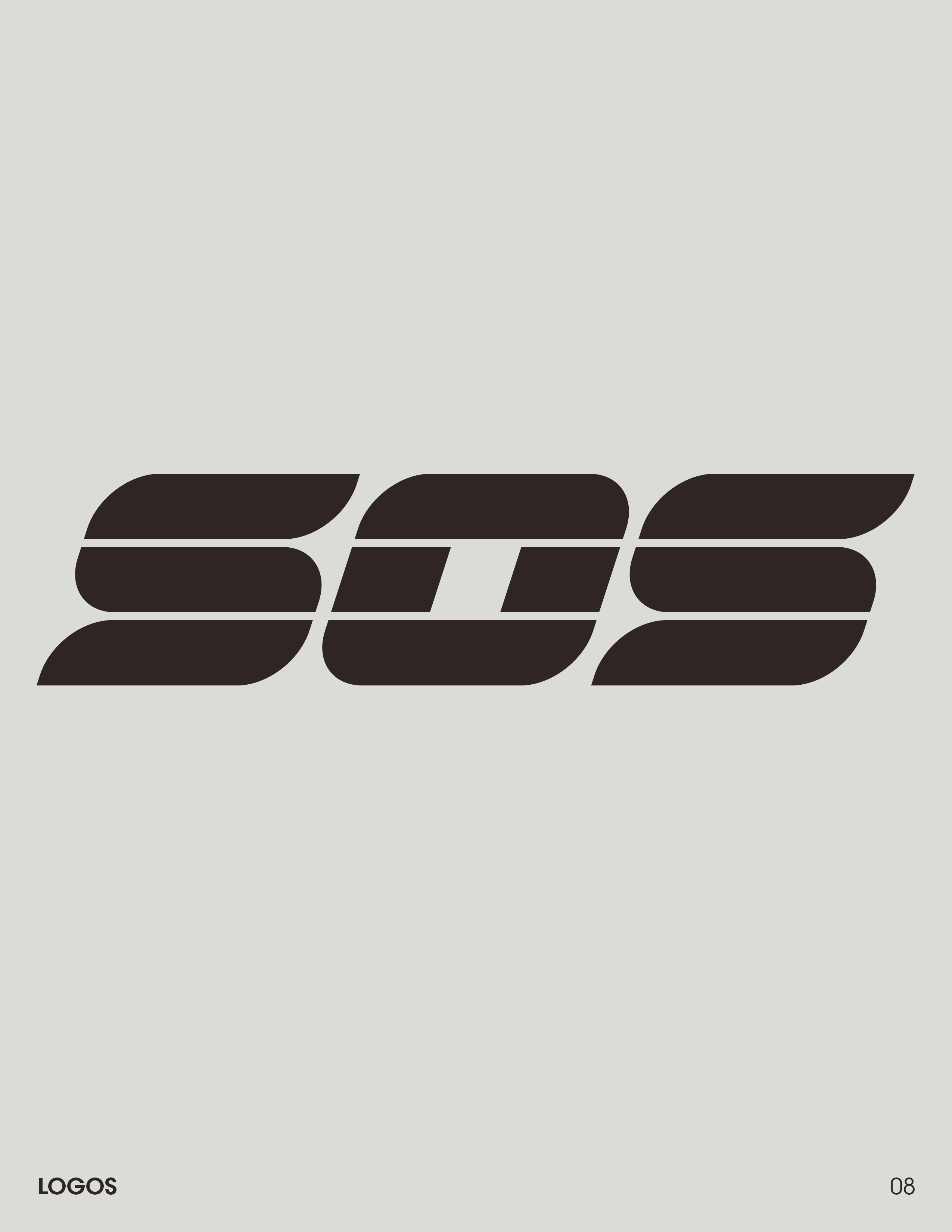
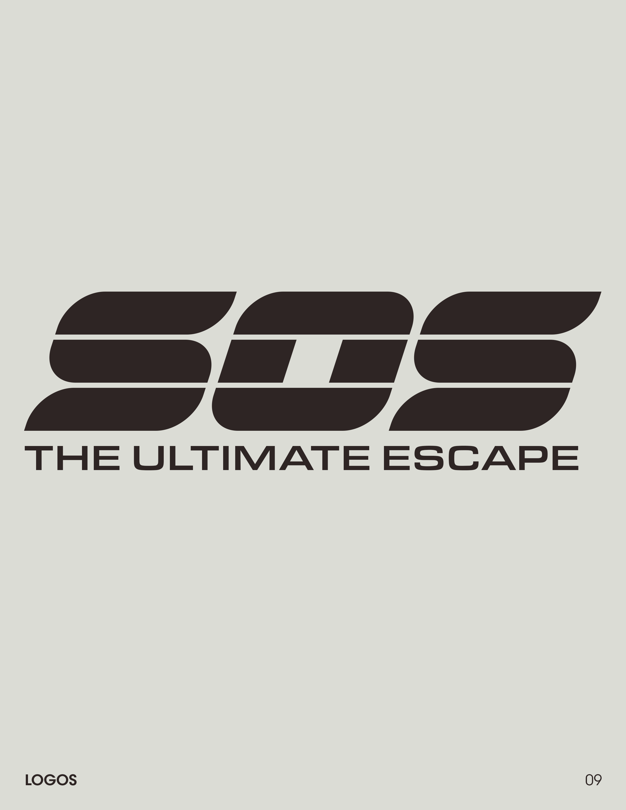
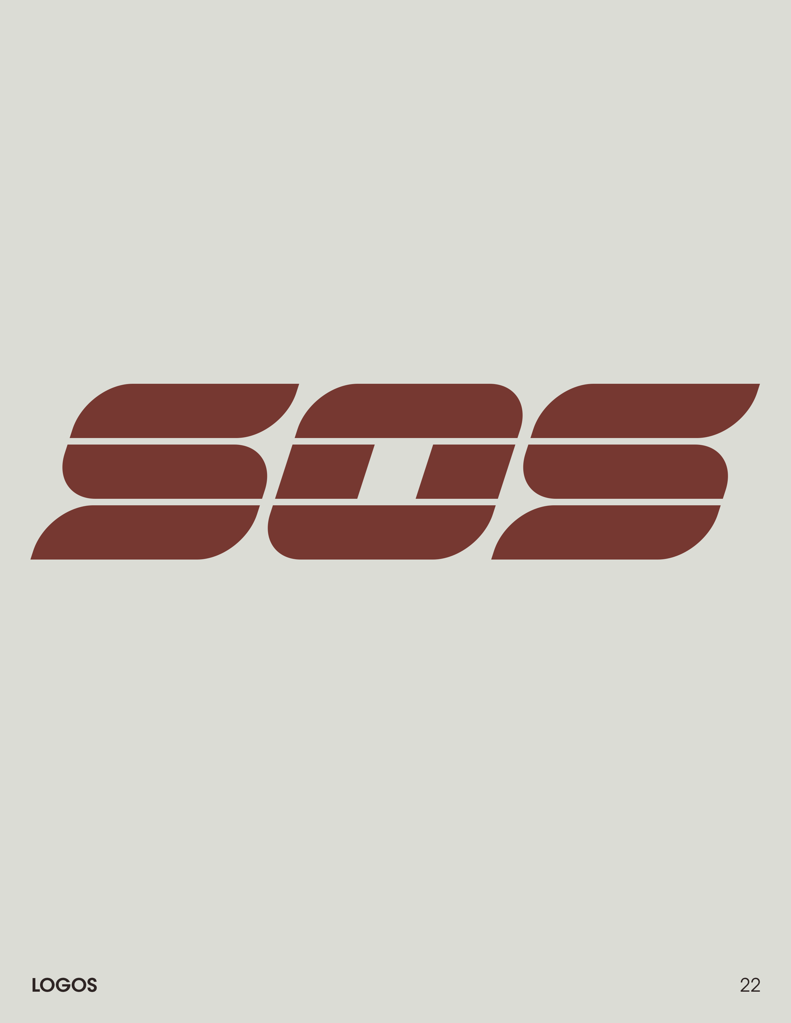
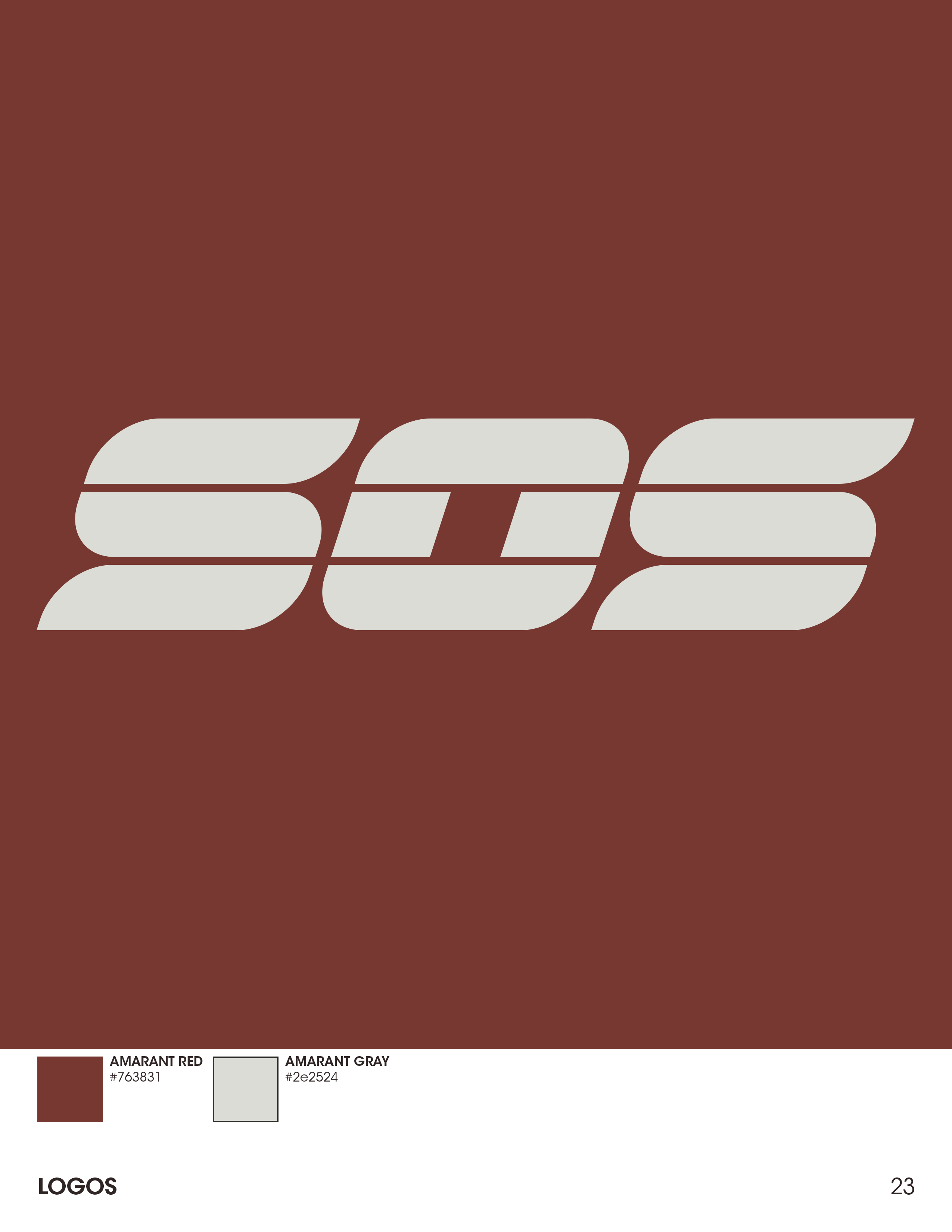
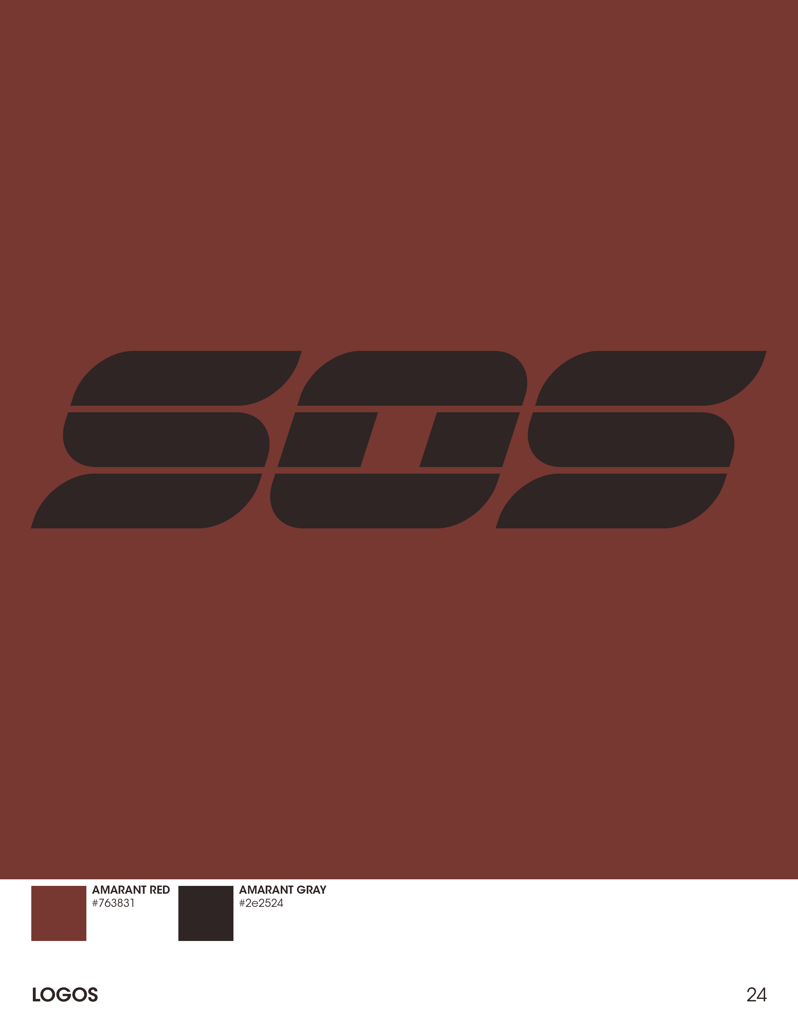
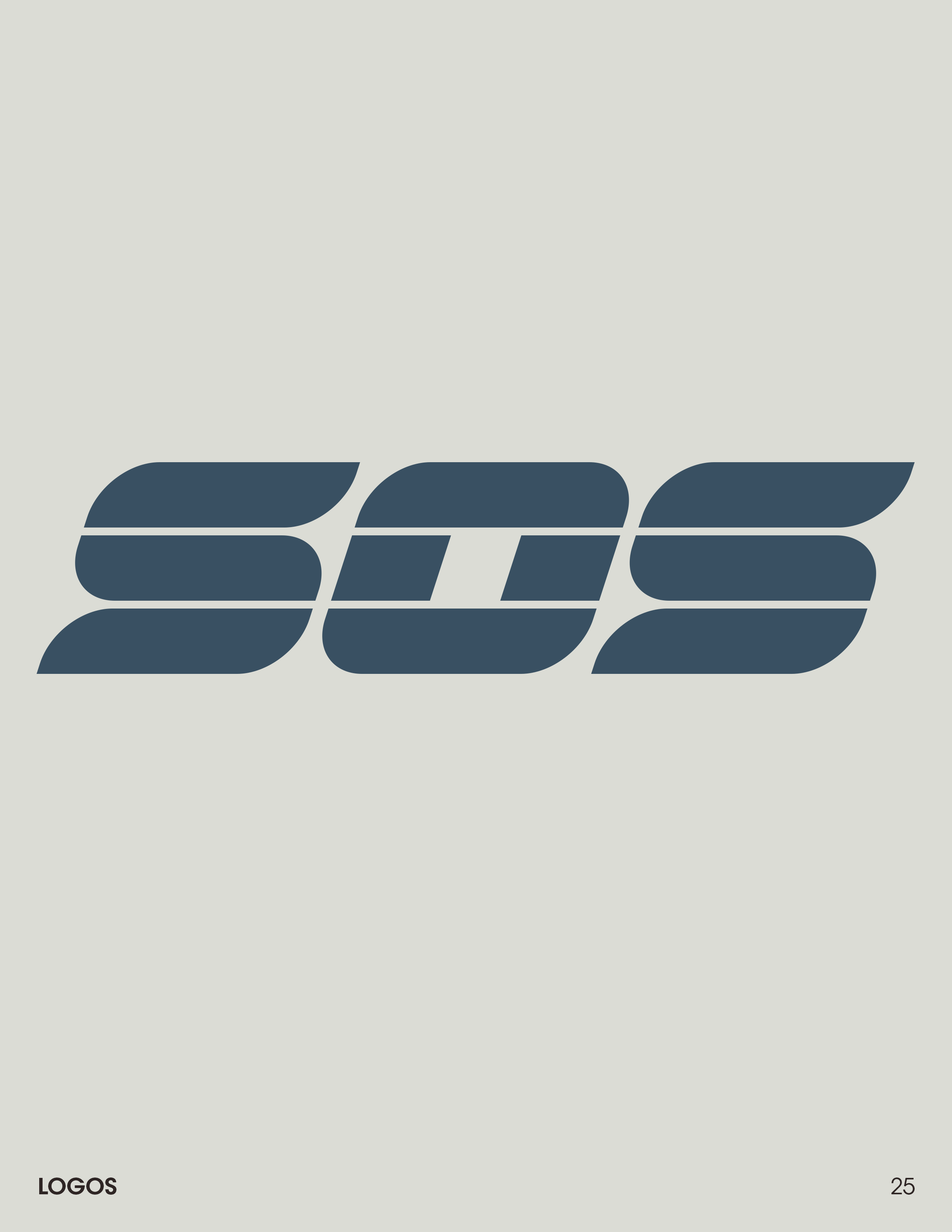
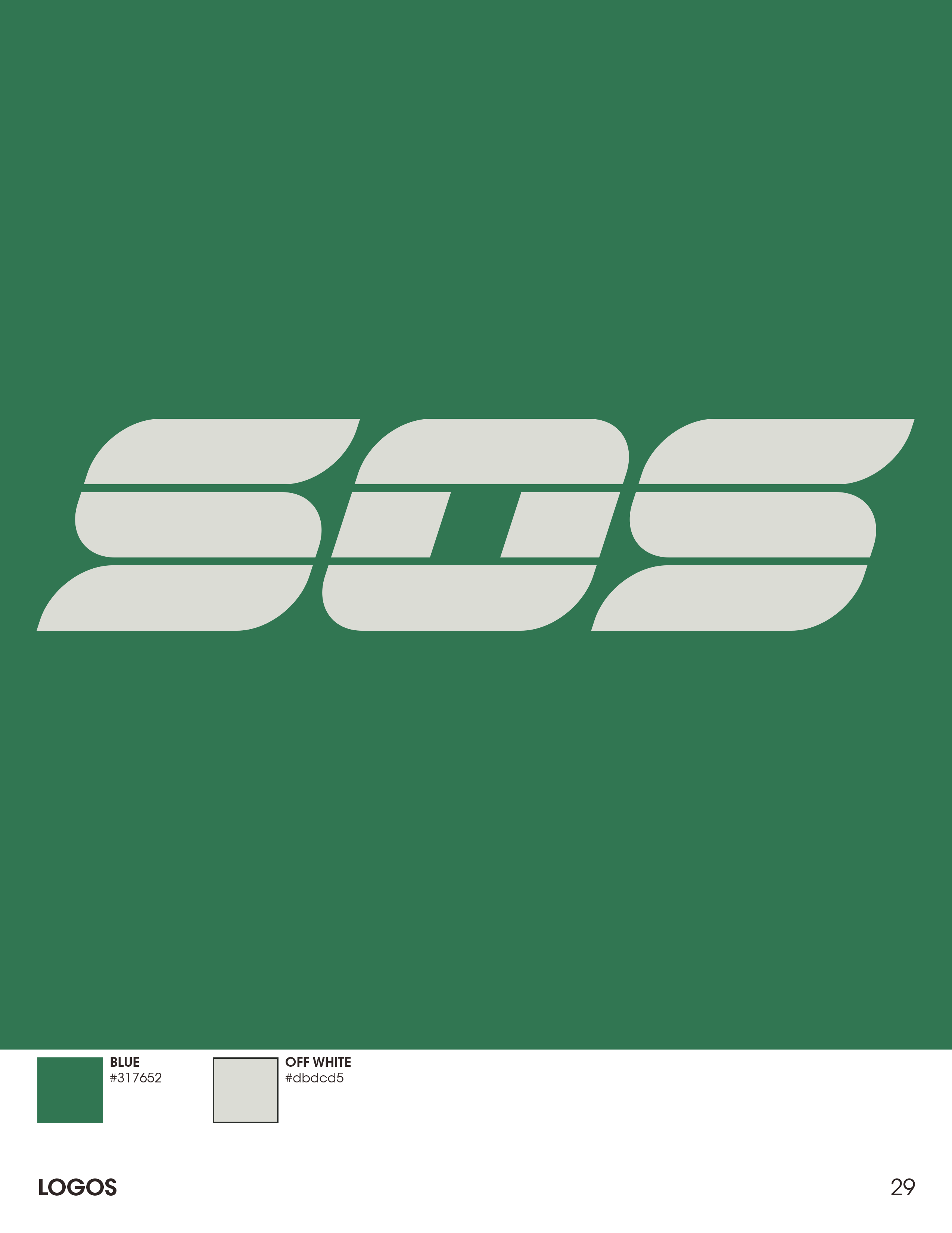
SOS
Once I had the Amarant branding I moved onto creating the SOS logo. It needed to be a bit more sleek yet still retro, as it was a TV show in the game world. It needed to be a bit more exciting. We looked at things like The Running Man's post-apocalyptic game show for inspiration along with many real world TV shows and movies created in the 80's. Again, we wanted to stay on the more sophisticated end of 80's styles rather than the rainbow colored and hyper chrome look that many from the 80's and 90's remember. The idea here was to create a logo that looked like it came from and was created by Amarant.
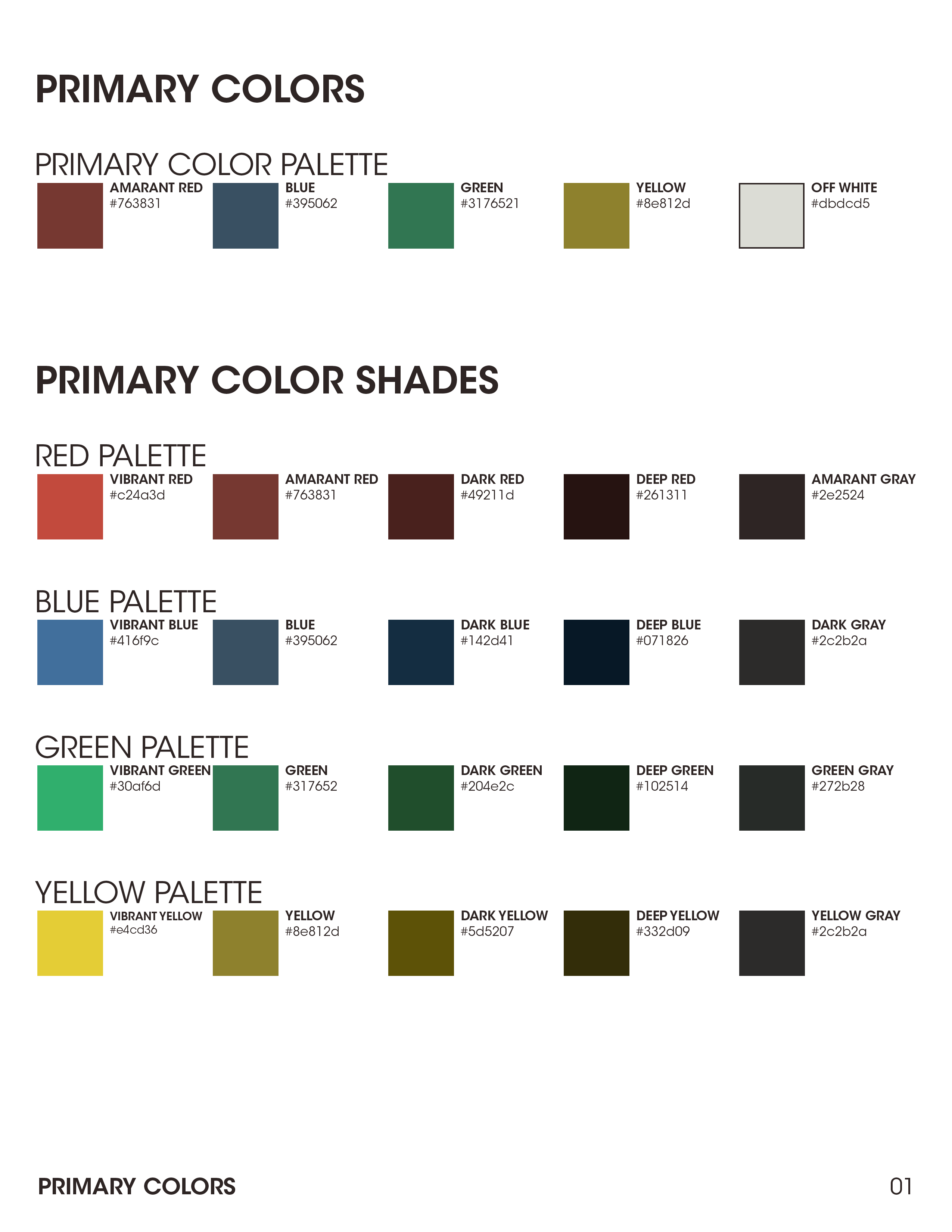
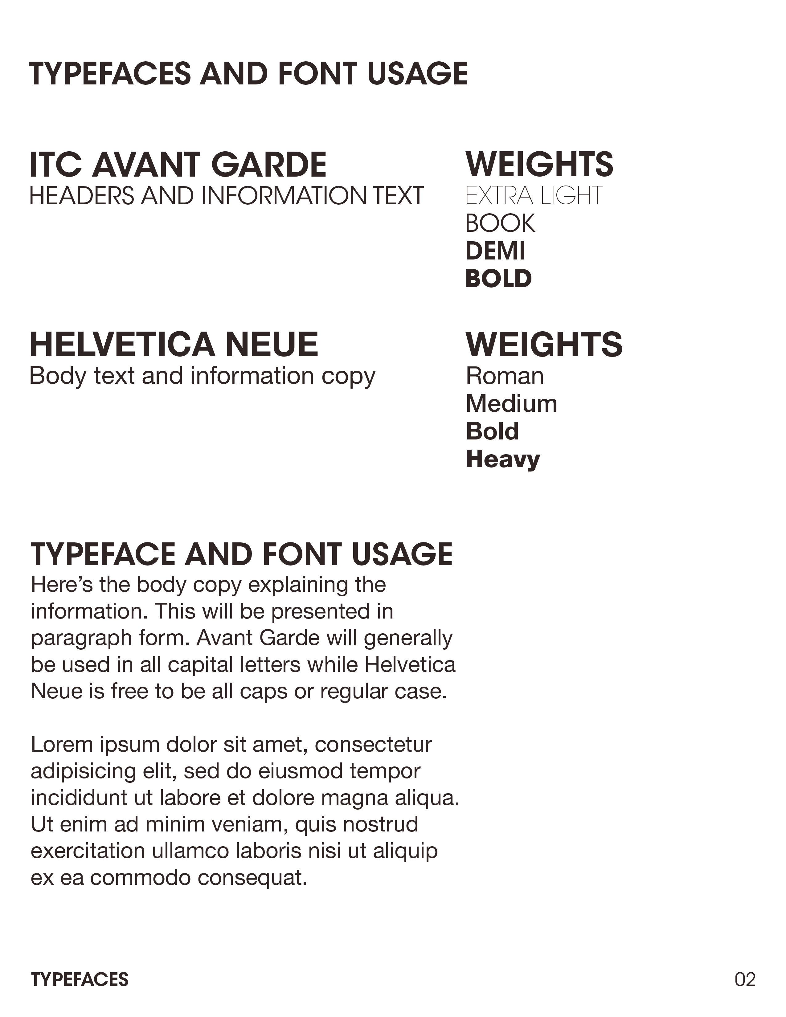
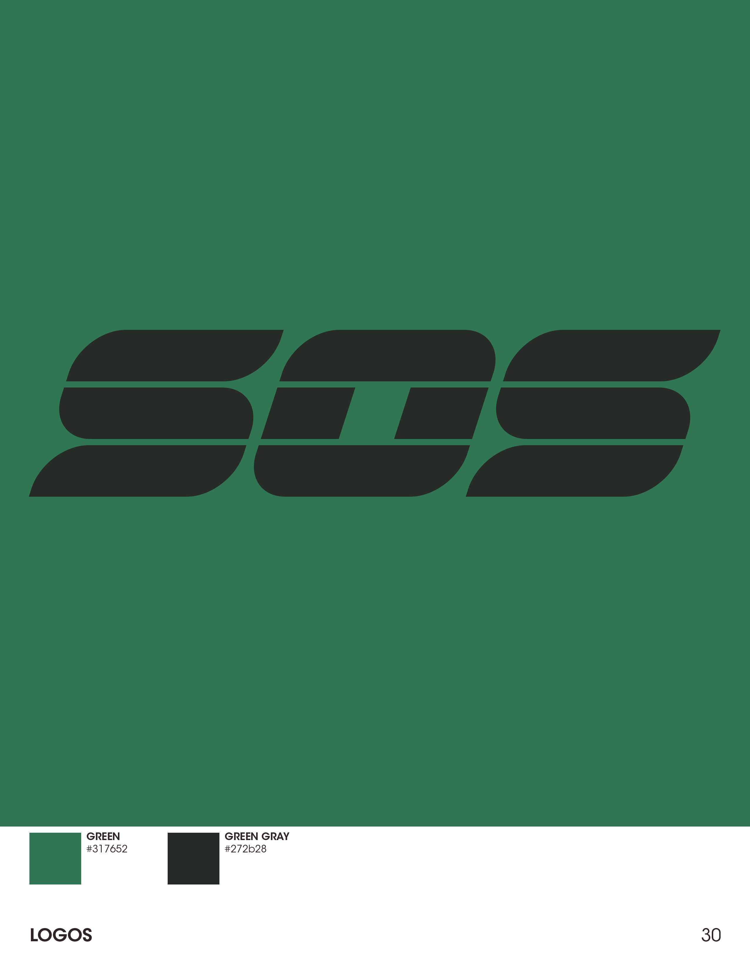
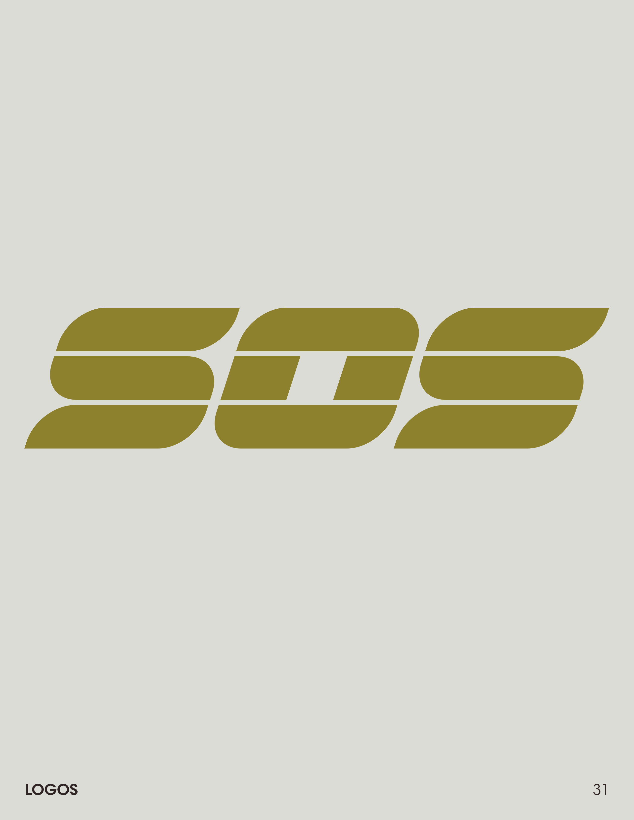
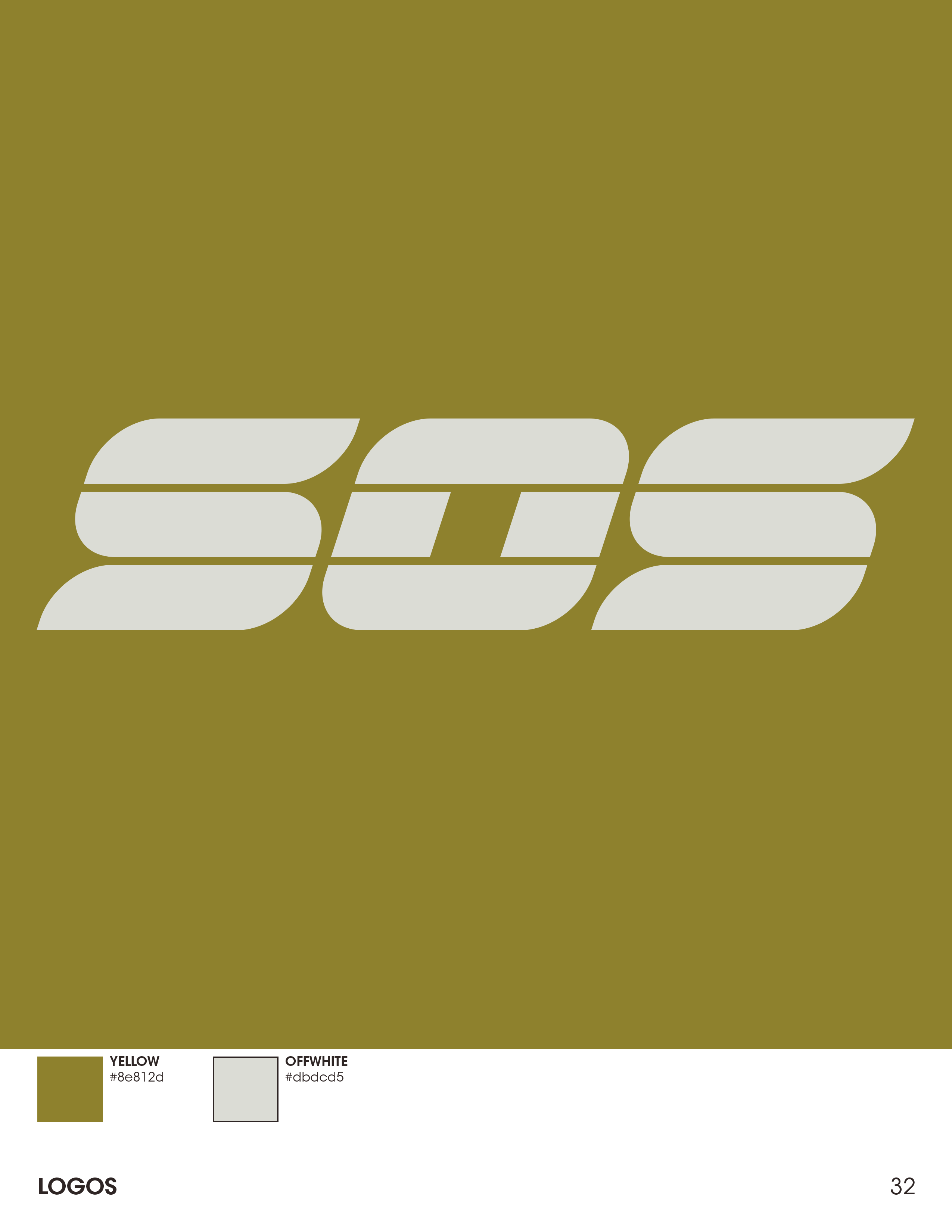
I created a brand style guide for Amarant and SOS to codify how we used the logos and colors.
SOS: IN-FICTION ANIMATIONS
I began exploring the motion graphics for the Amarant logo that would play before the game intro. I started with a more colorful approach before settling on the more ominous slow chrome rotation. We liked the more sophisticated and serious feel of the icon reveal paired with the more friendly rounded word mark's flowey reveal. The contrast between the two helped create an uneasy feeling that made you wonder who or what this mysterious company was. We wanted to plant seeds in the minds of the players, that there was depth and mystery to this world.
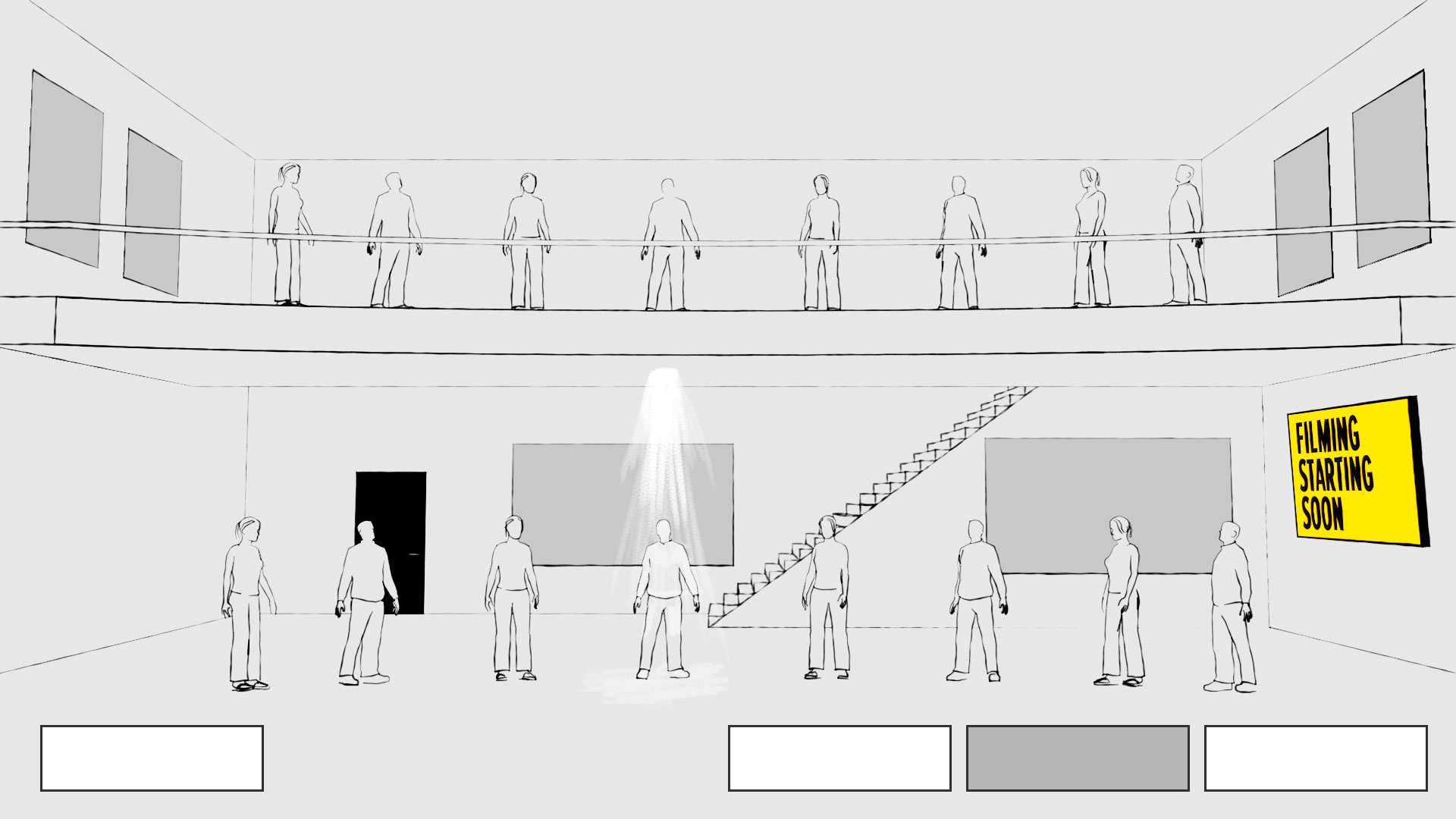
IN-GAME & IN-FICTION INSTRUCTIONAL VIDEO
The instructional video was played for every player before each match to help inform and guide the players as to their goals. The idea was that it would also be shown to the prisoners so it needed to feel like a corporate-made informational video as it wasn't shown to the public, only the contestants.
OUTPOST DEVELOPER TWITCH STREAM VIDEOS
During development of SOS, Outpost did many developer diary type Twitch streams to help build awareness for the game as well as let people learn a bit more about Outpost as a company and the people behind the game. I created a series of animations we used to brand the streams around SOS and Amarant to begin seeding the mystery and world to the viewers.
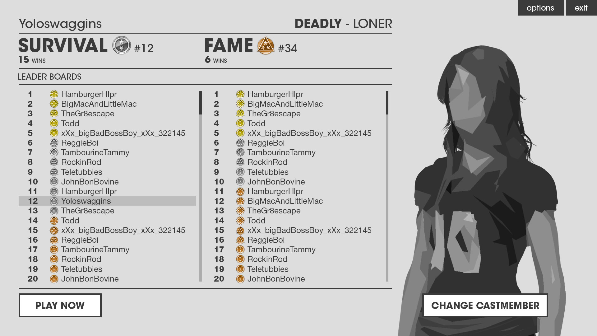
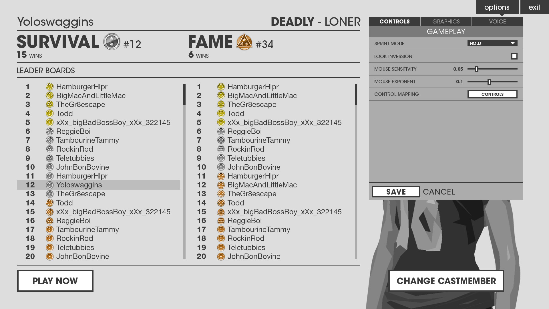
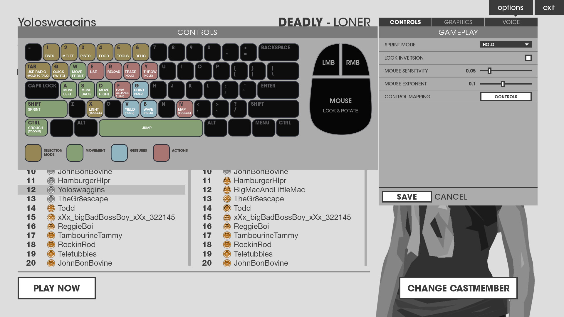
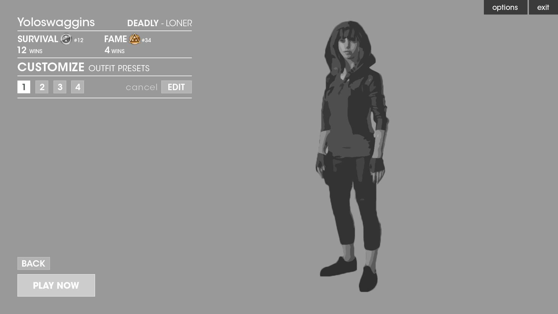
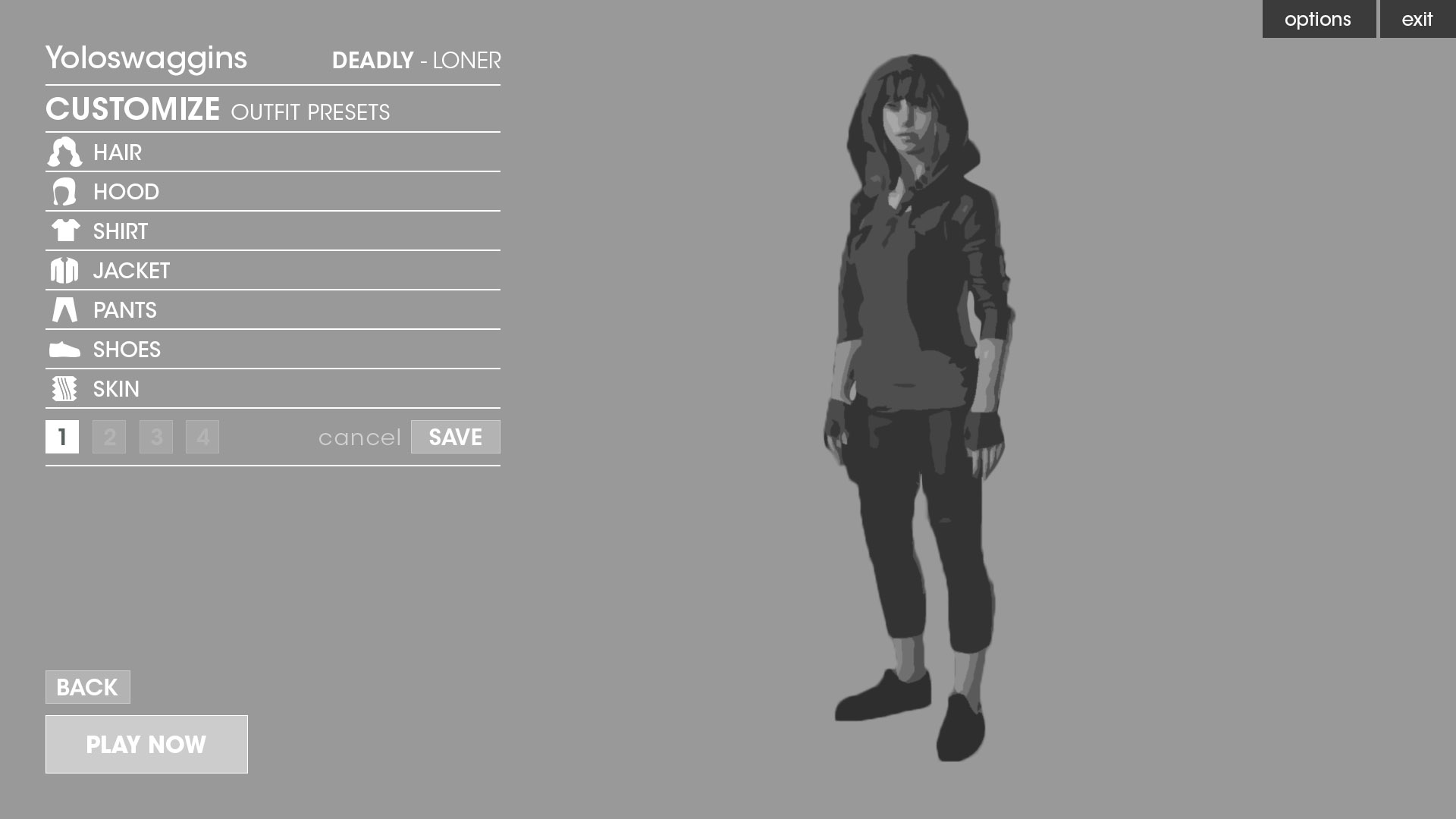
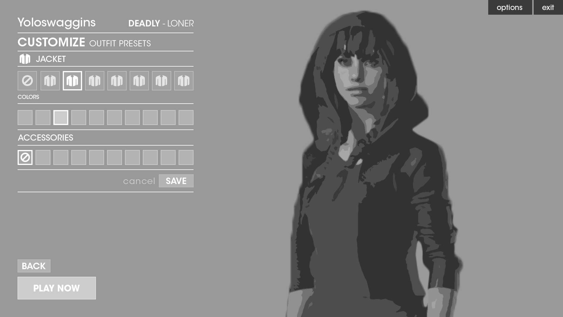
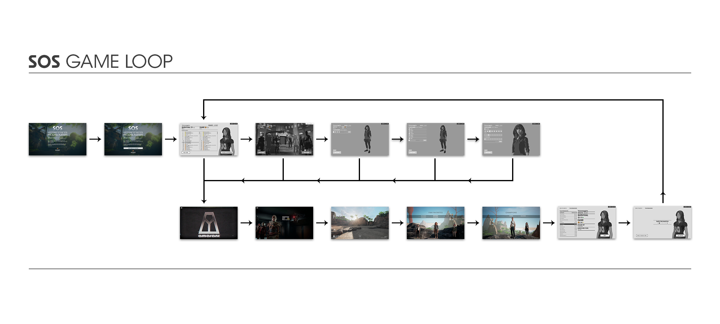
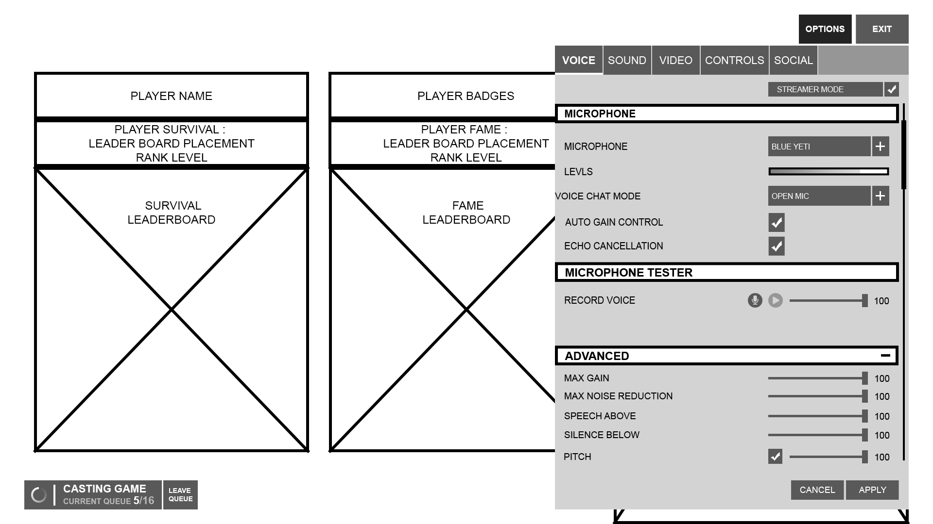
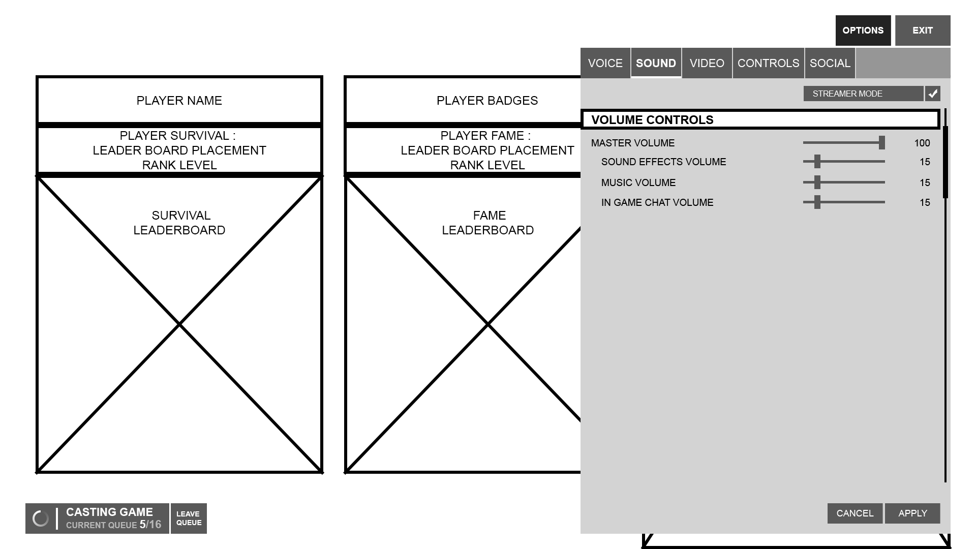
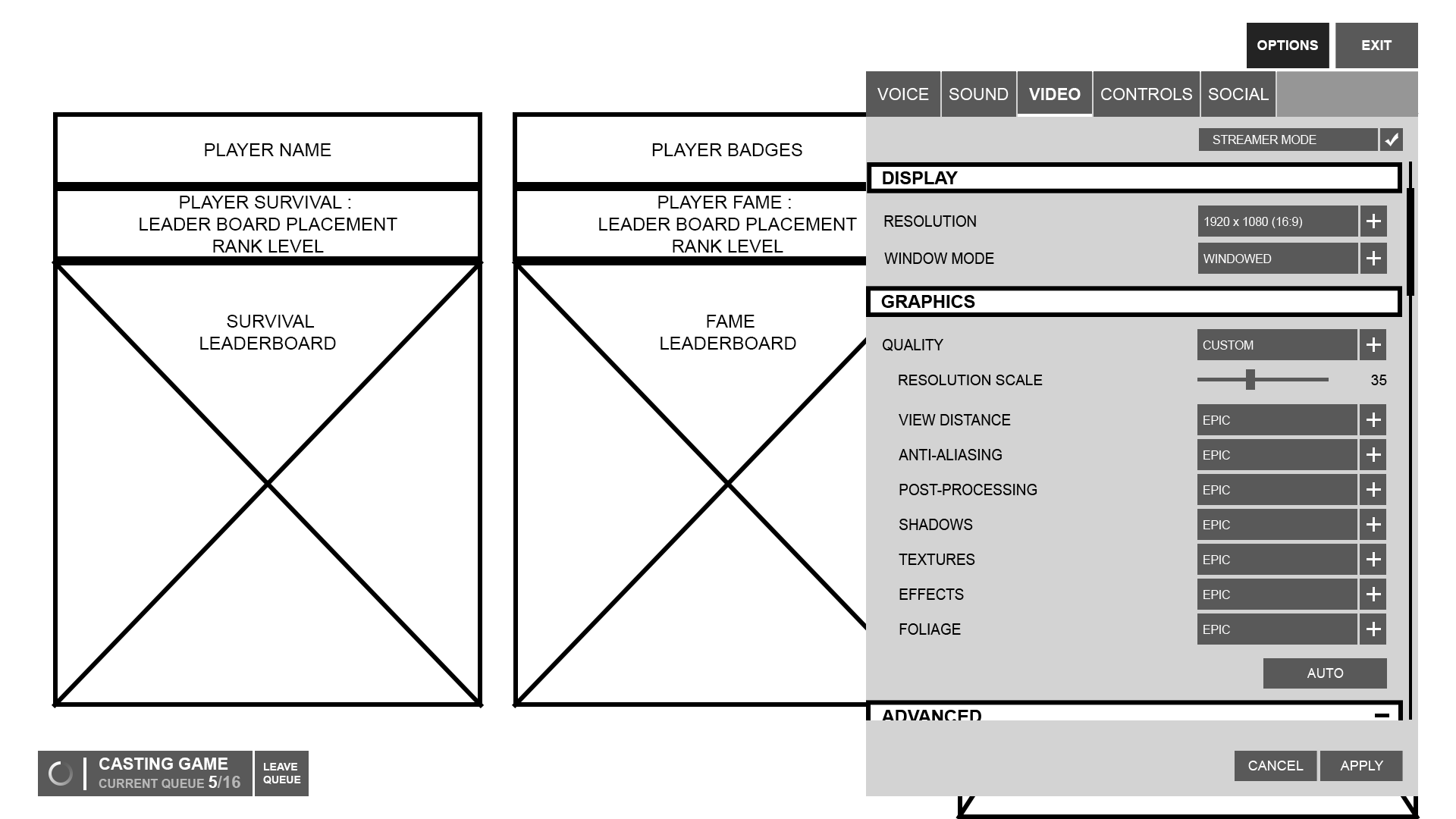
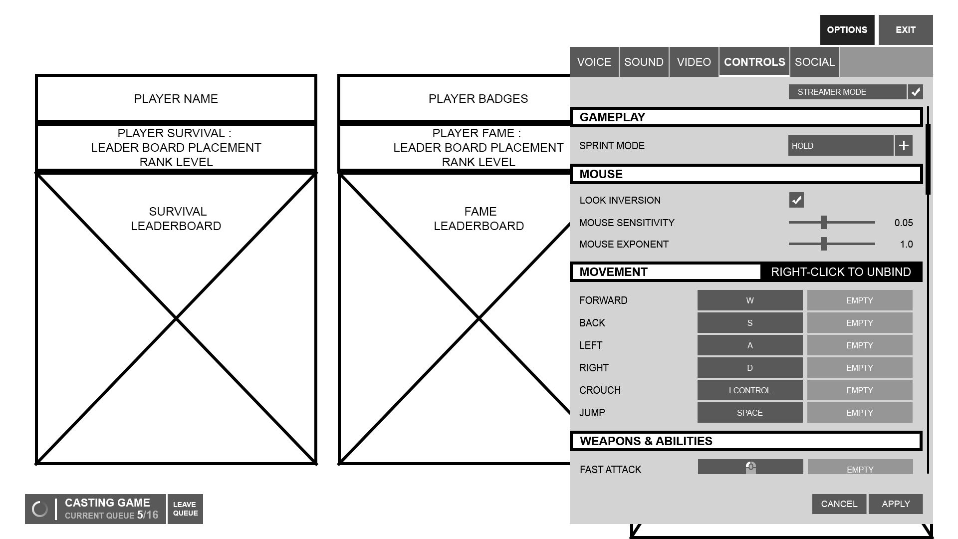
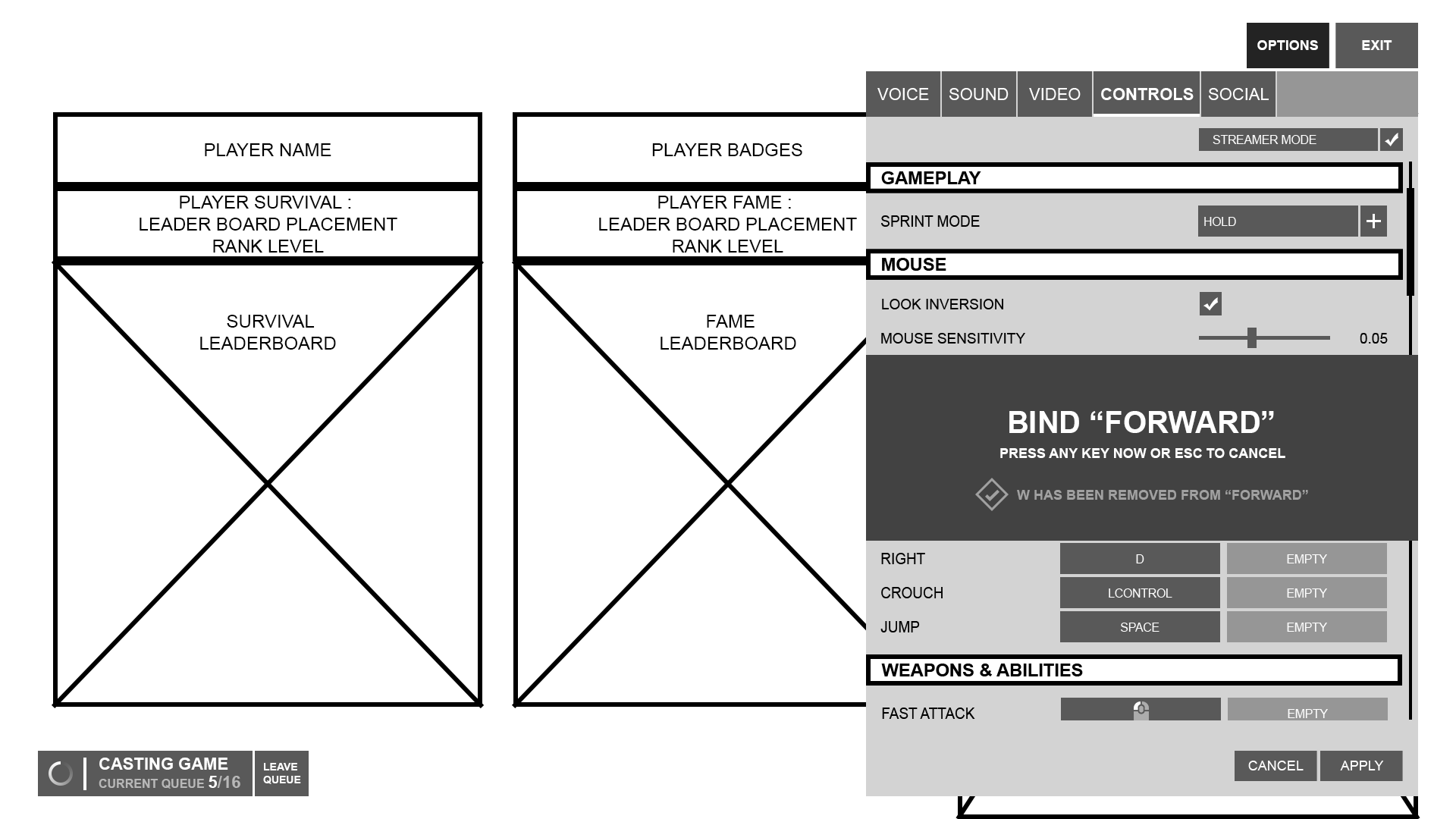
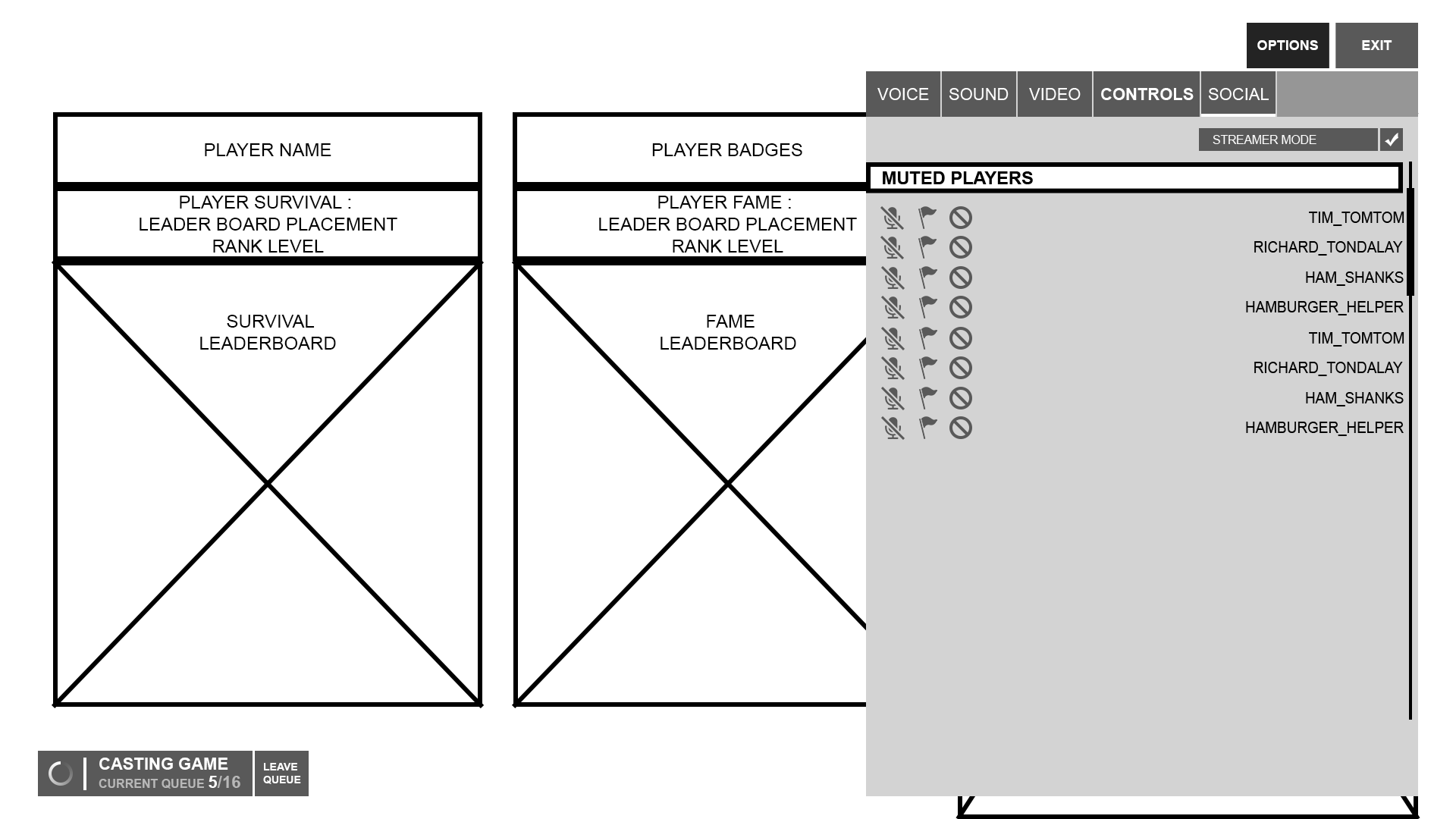
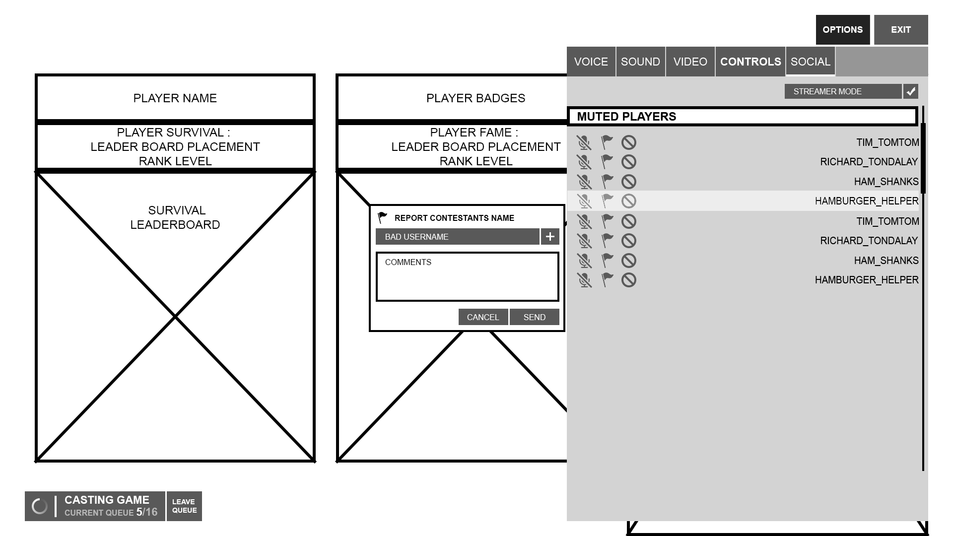
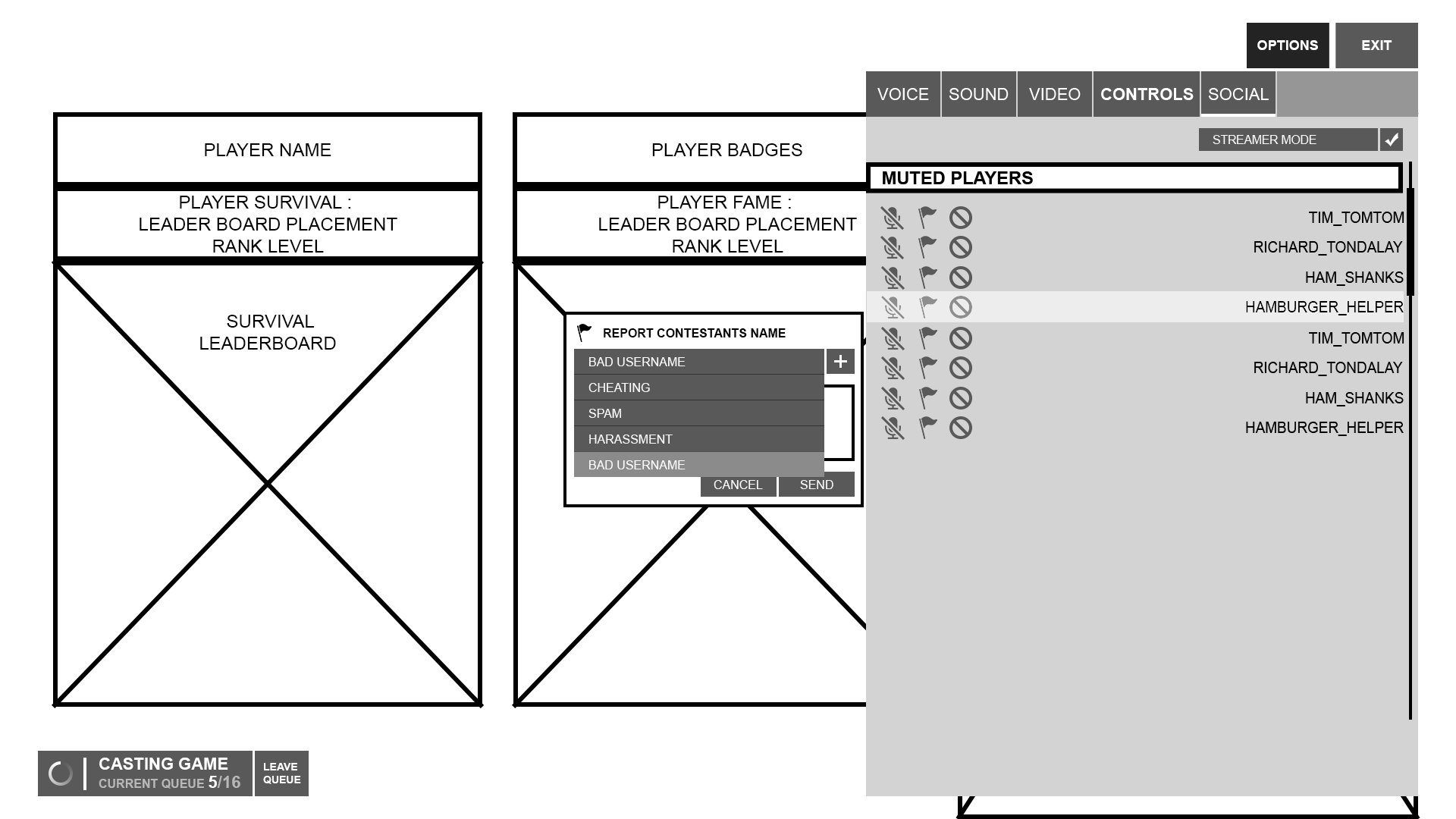
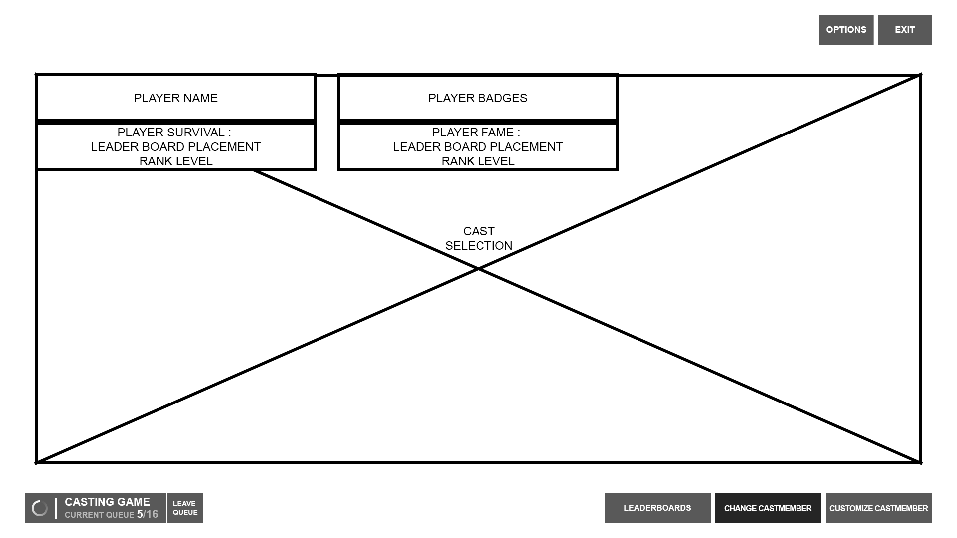
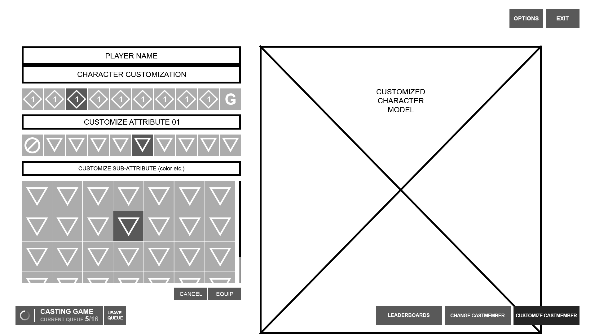
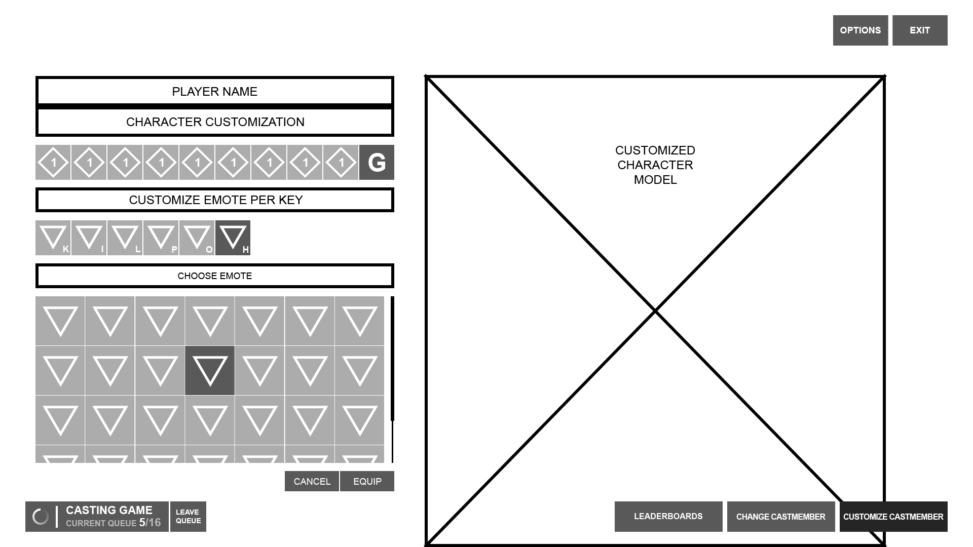
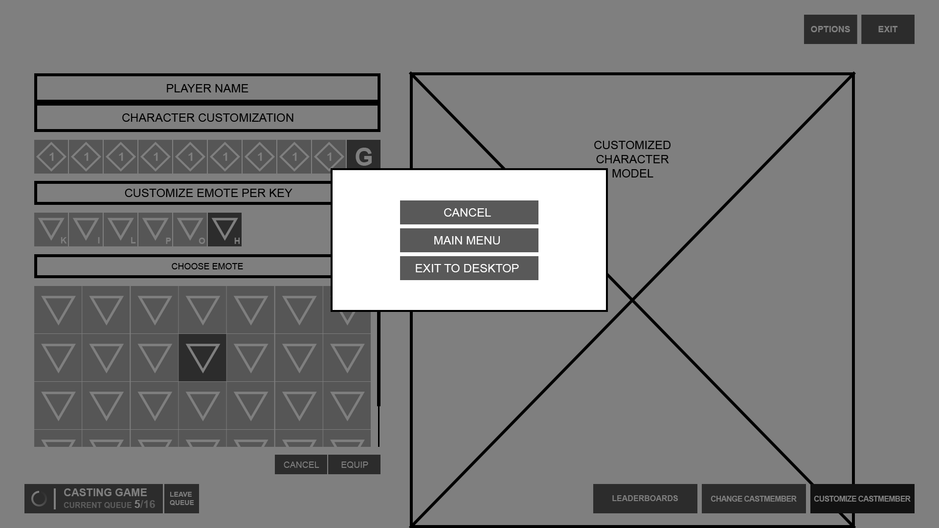
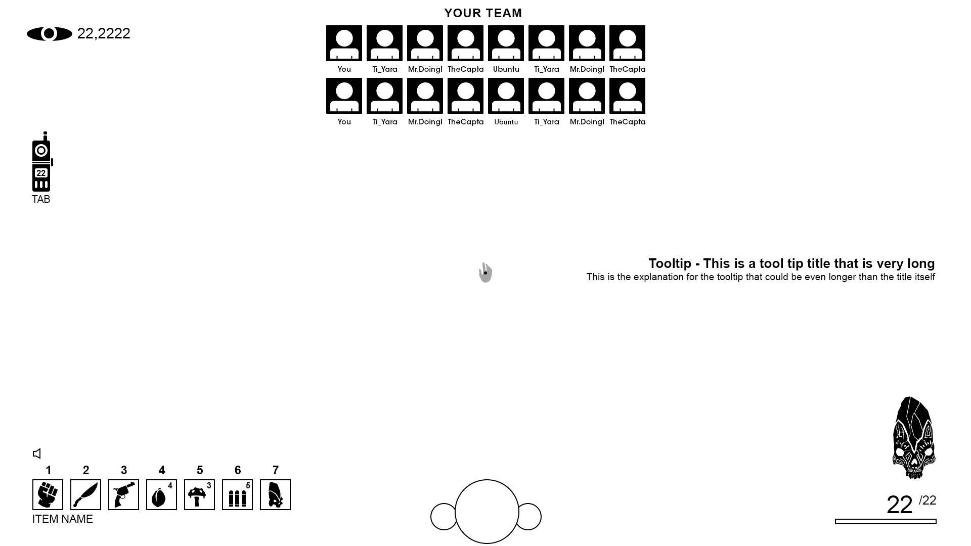
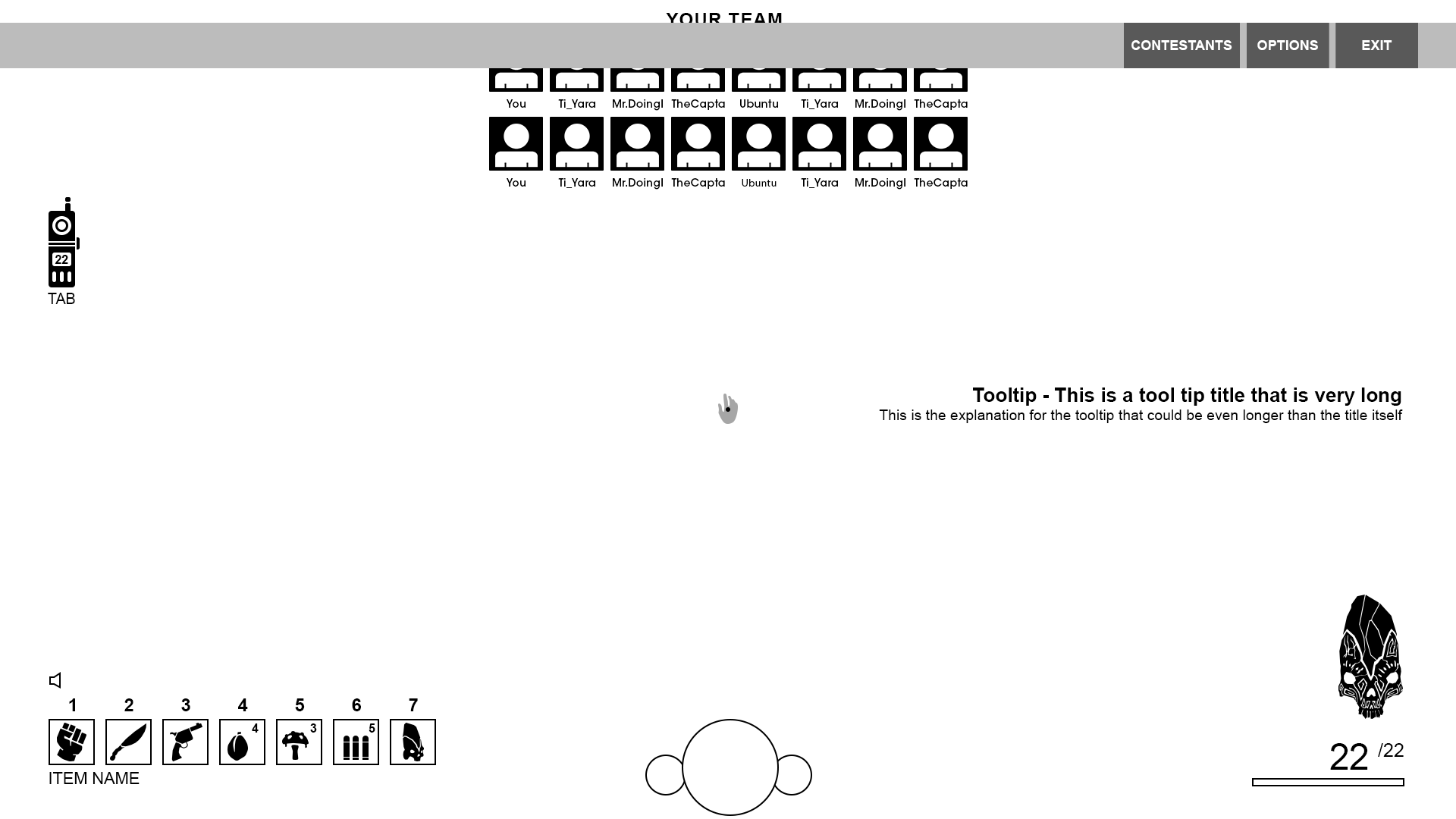
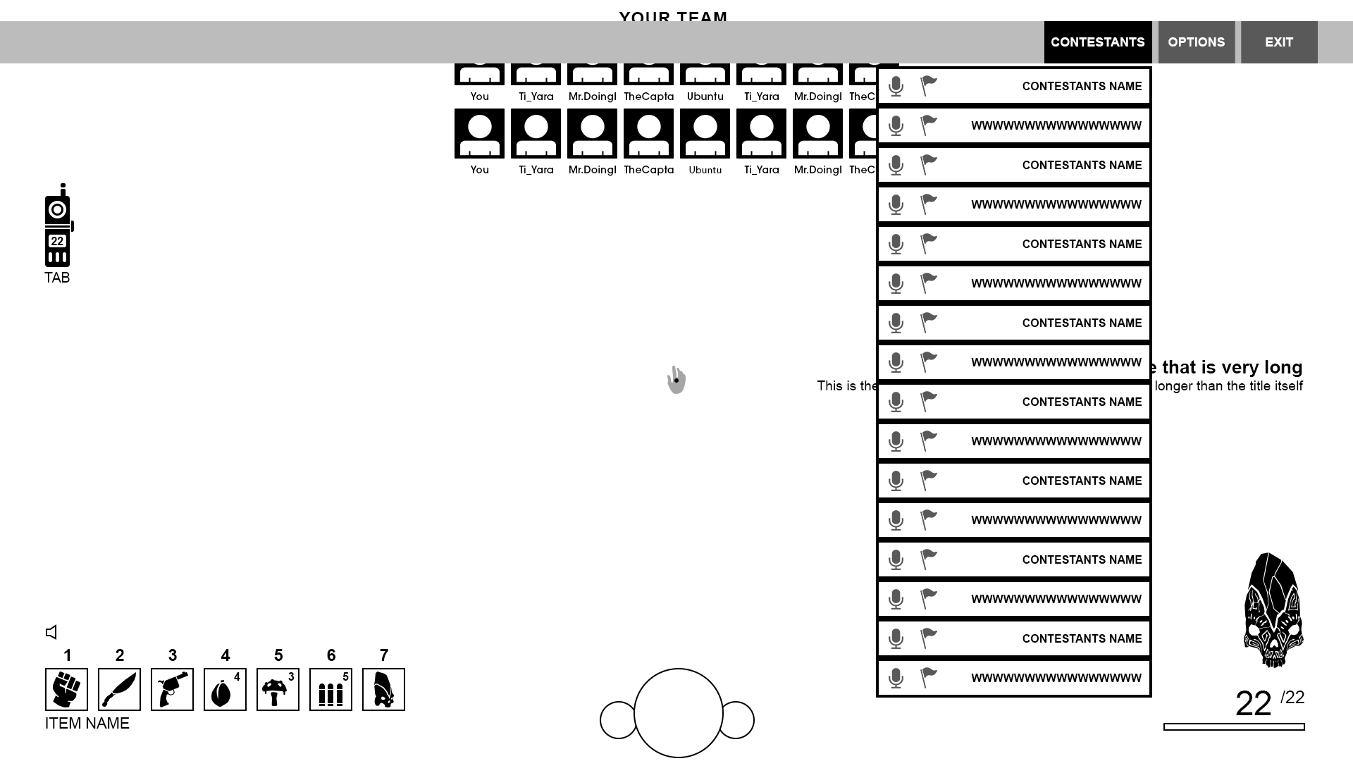
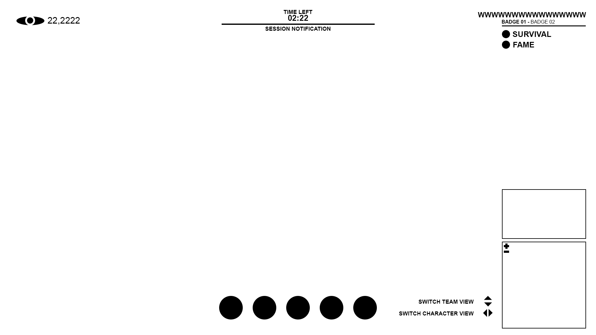
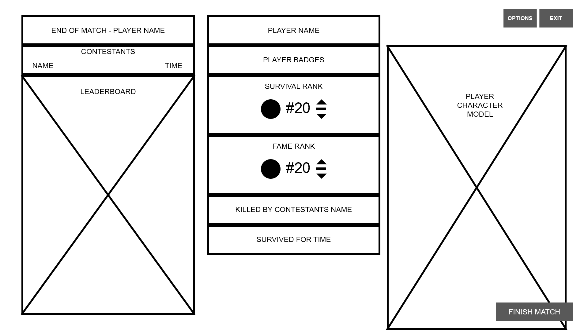
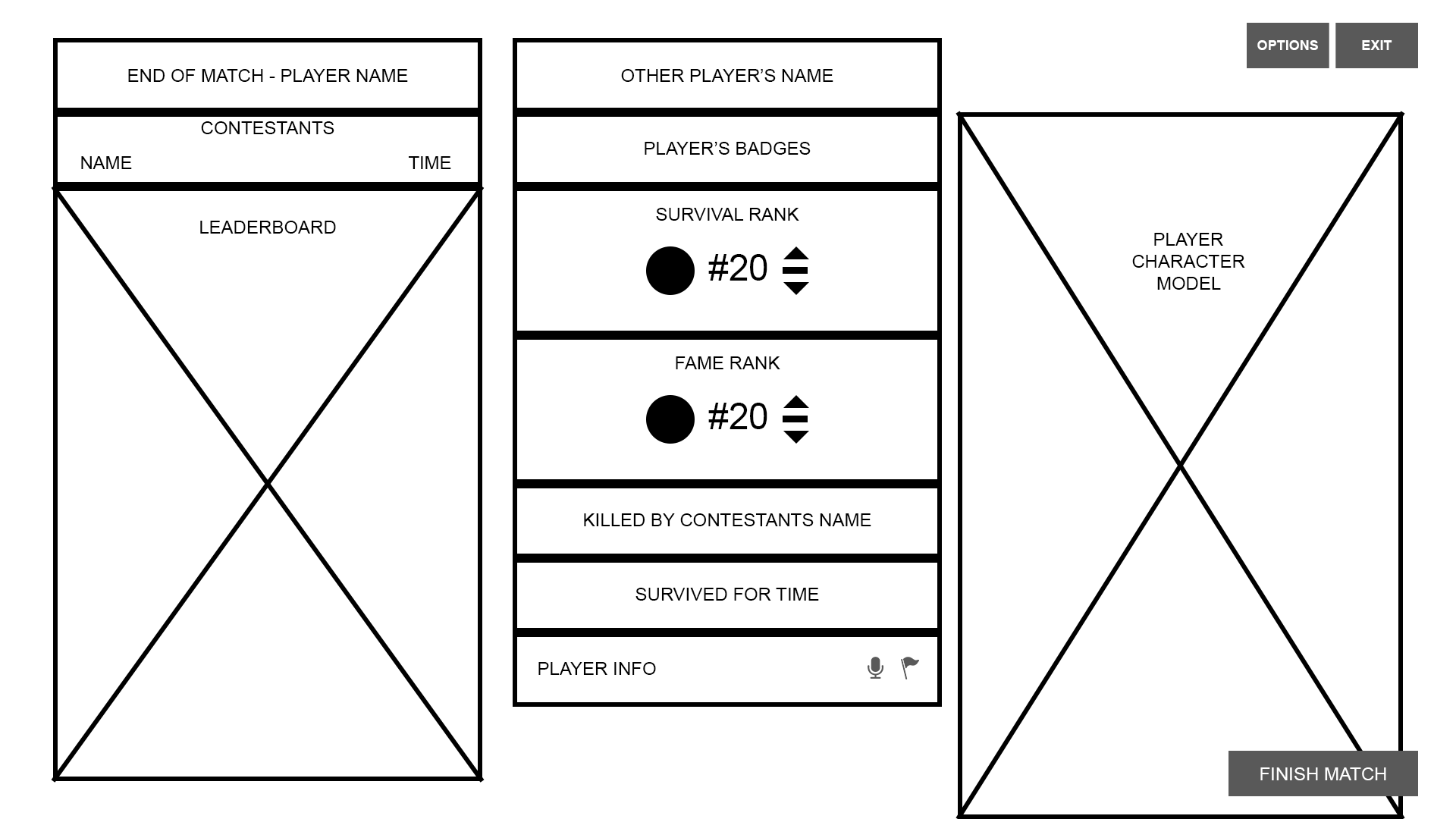
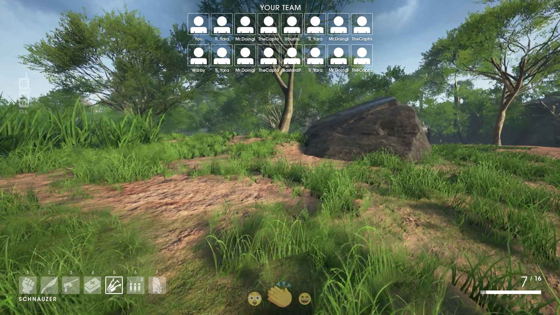
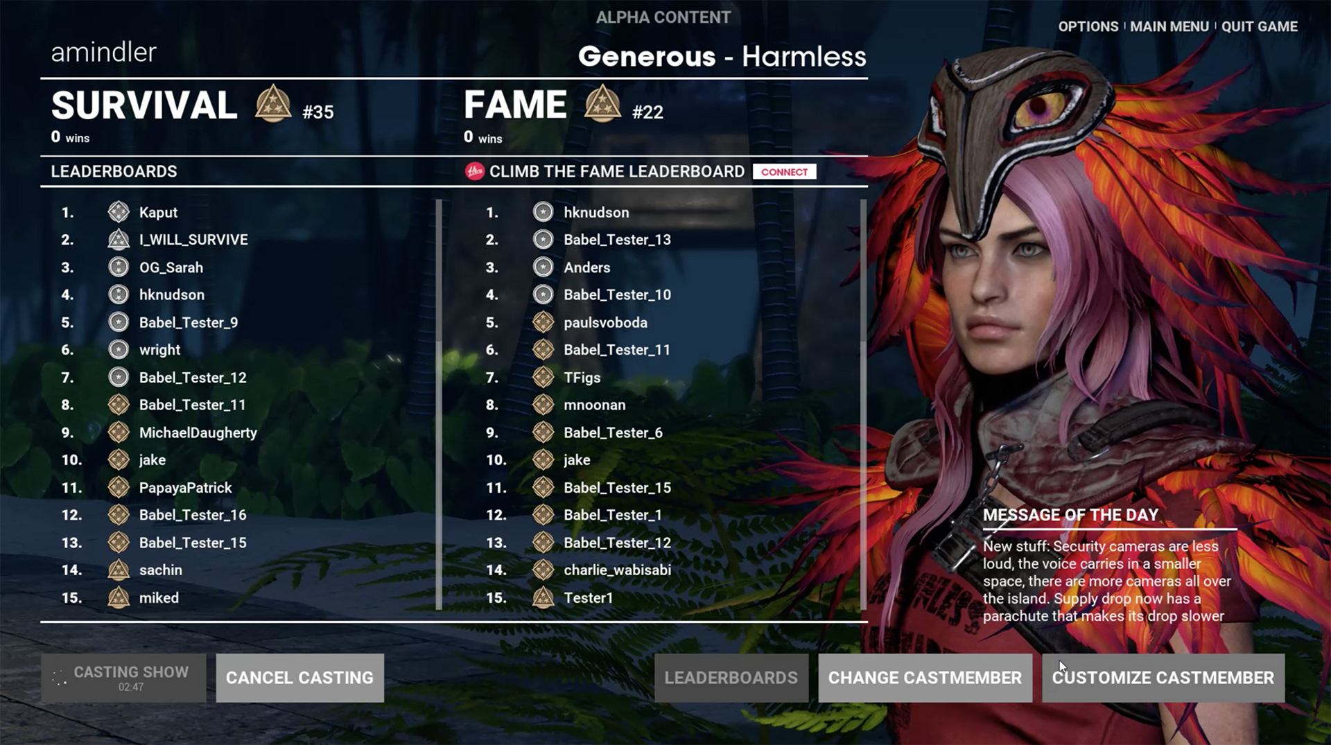
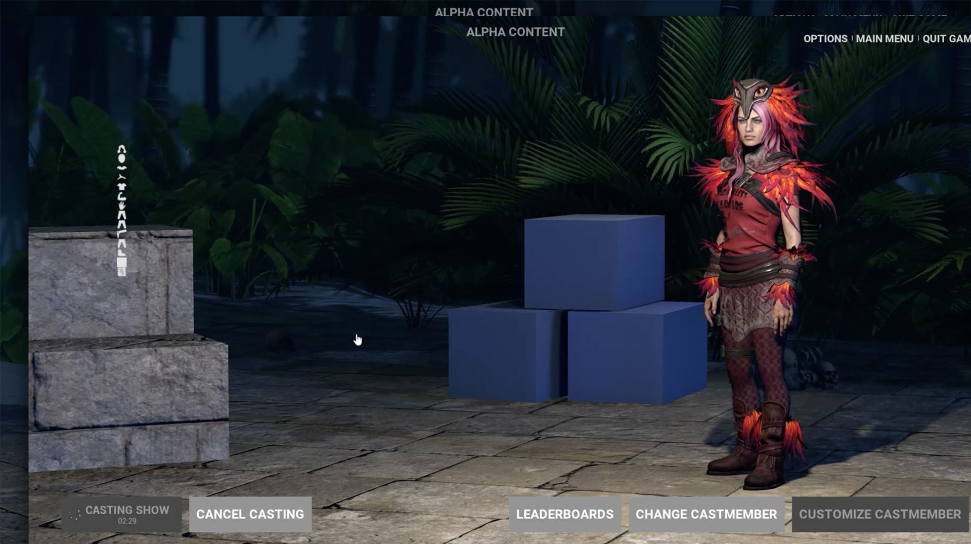
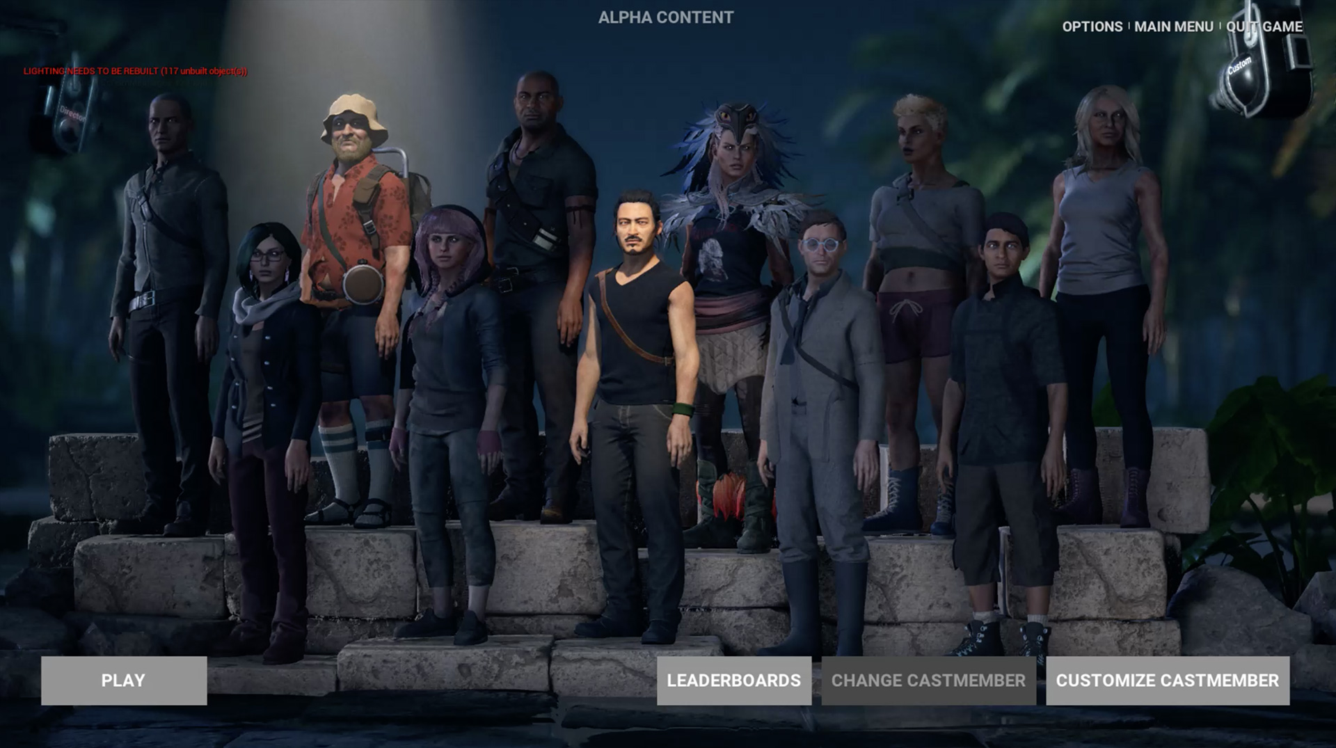
IN-GAME UI & UX
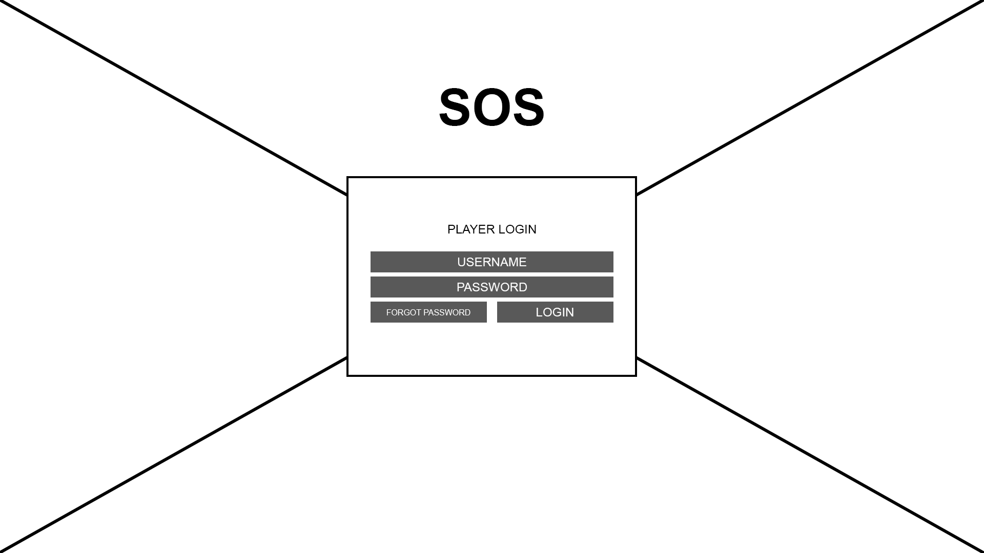
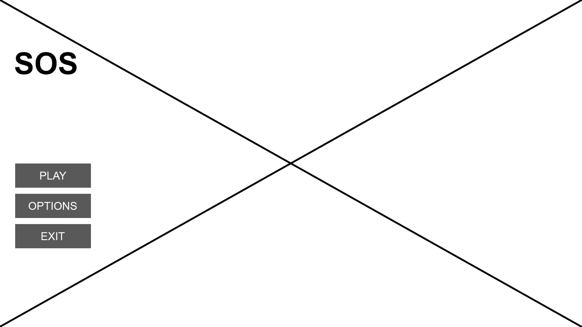
FIRST ROUND - HIGH FIDELITY MENU WIREFRAMES
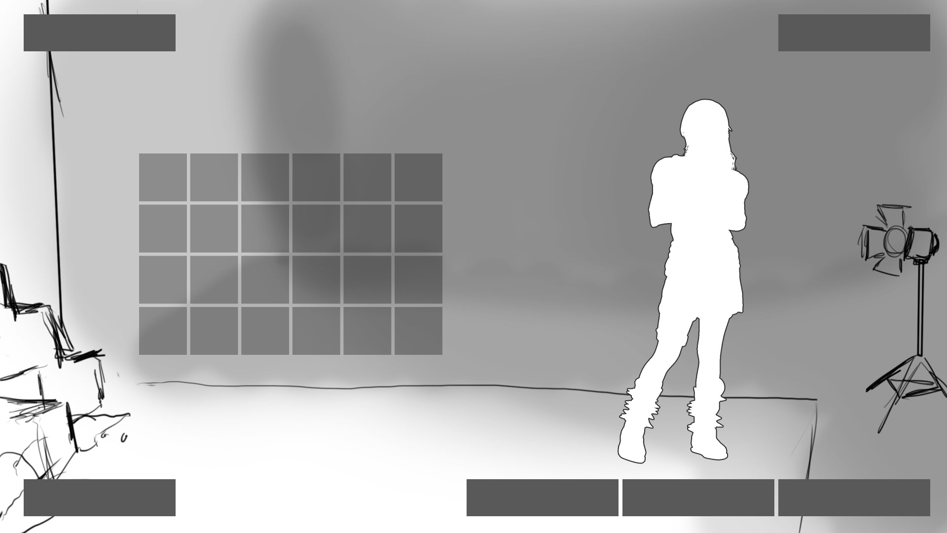
After creating the style guide I did some high fidelity wireframes of the menu system along with some UX flows to show how the game in its current iteration could work and what screens we needed to accomplish this.
MENU UX FLOW EXPLORATION
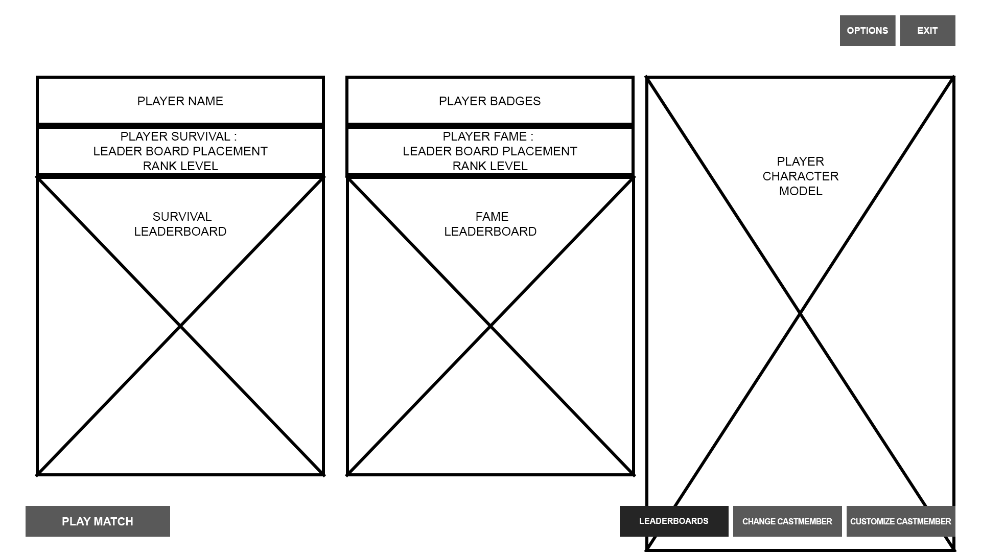
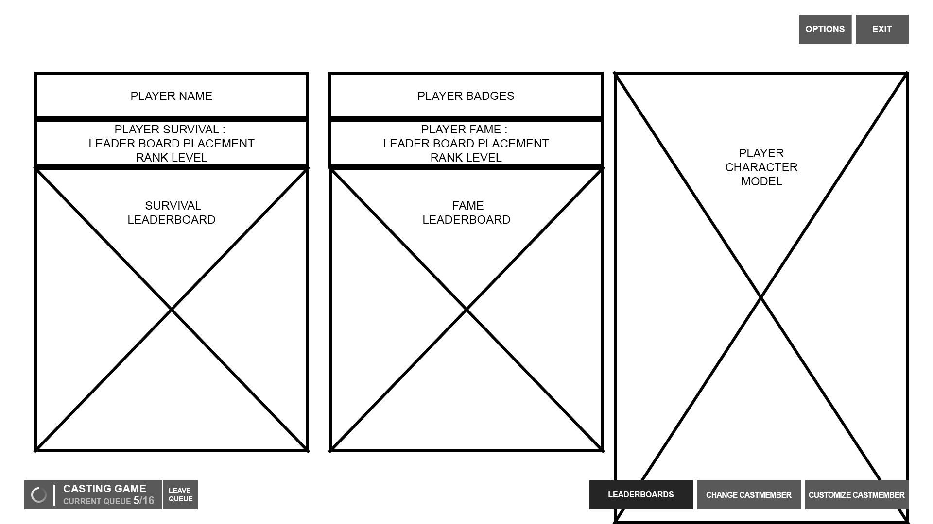
Once we had the original screens in-game, I spent more time exploring expanded user flows with deeper functionality and a more robust framework that would continue to work as new content was added to the game. These flows also followed the entire game loop from start to finish.
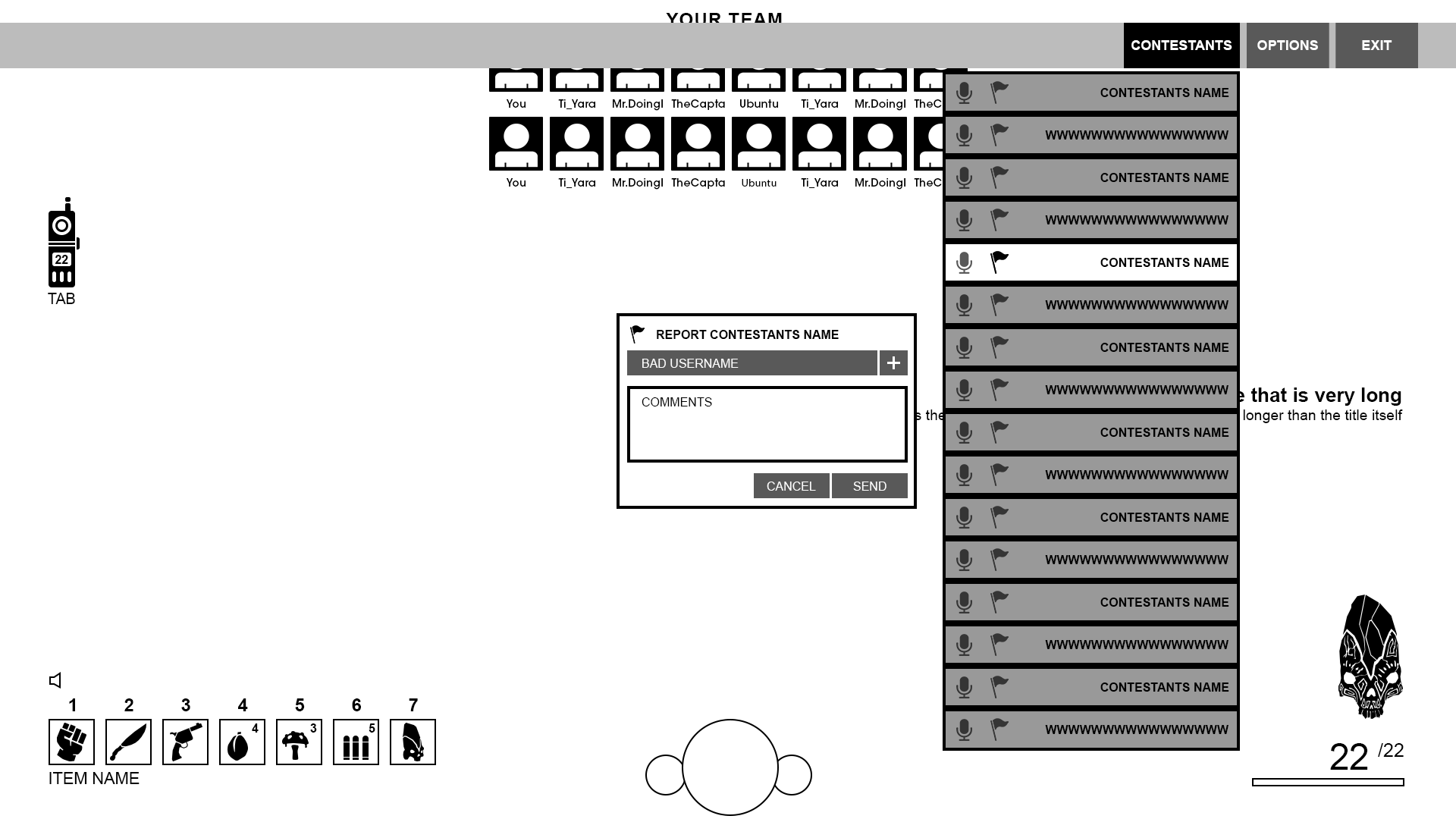
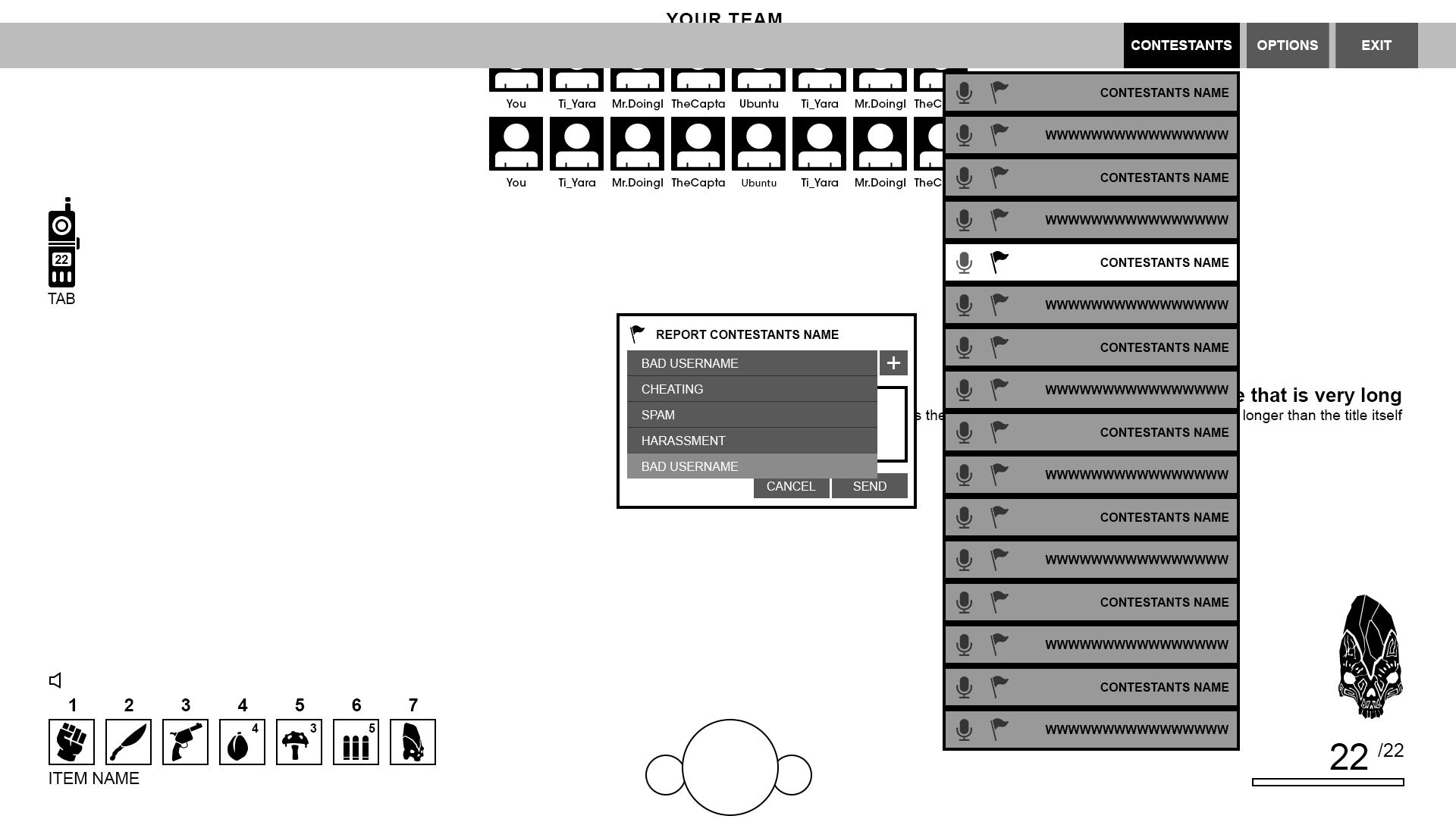
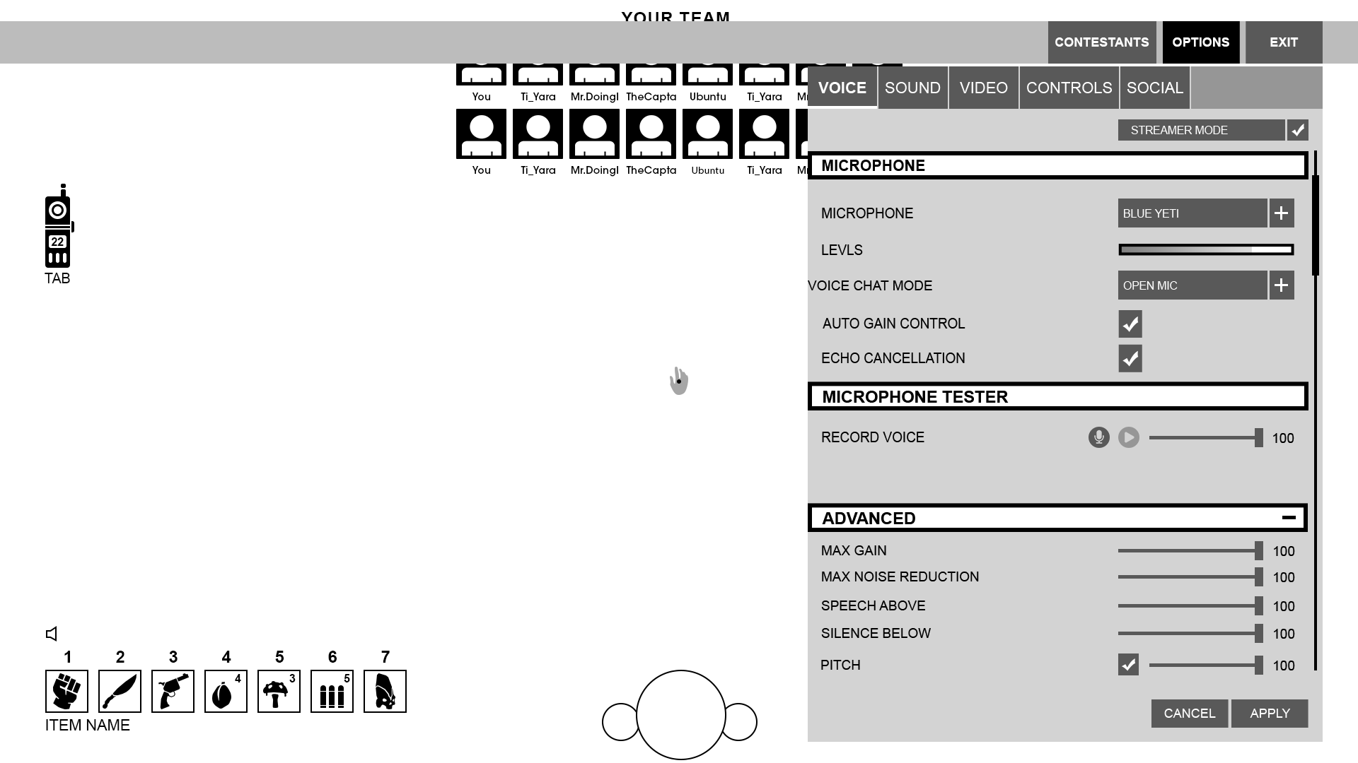
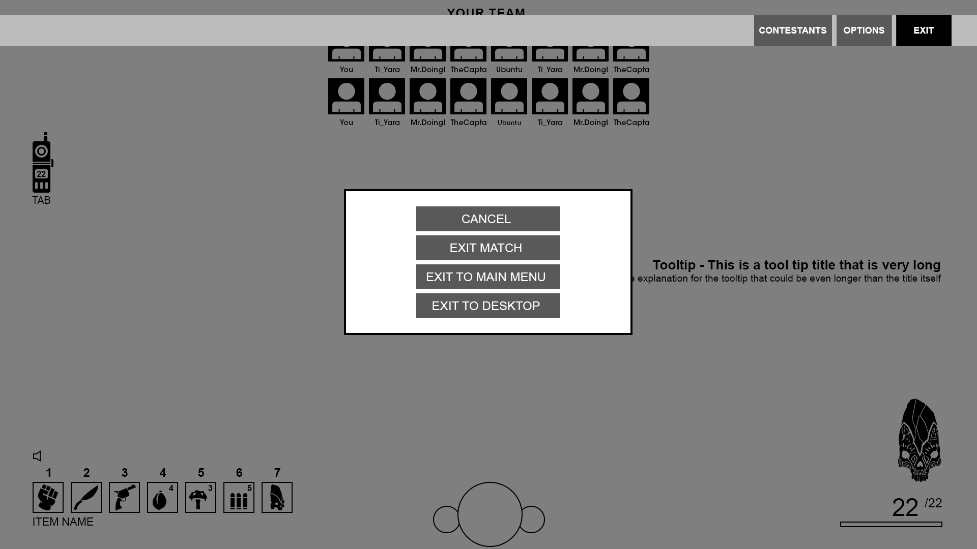
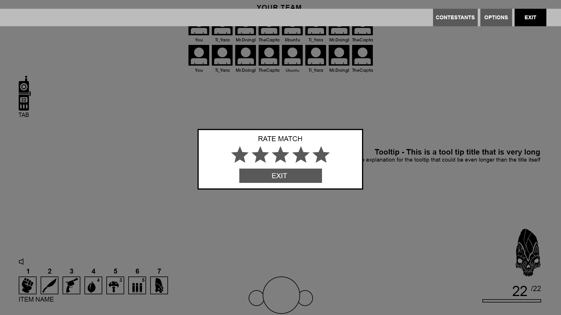
ICONOGRAPHY
HUD HIGH FIDELITY WIREFRAME
Hey there, this is the default text for a new paragraph. Feel free to edit this paragraph by clicking on the yellow edit icon. After you are done just click on the yellow checkmark button on the top right. Have Fun!
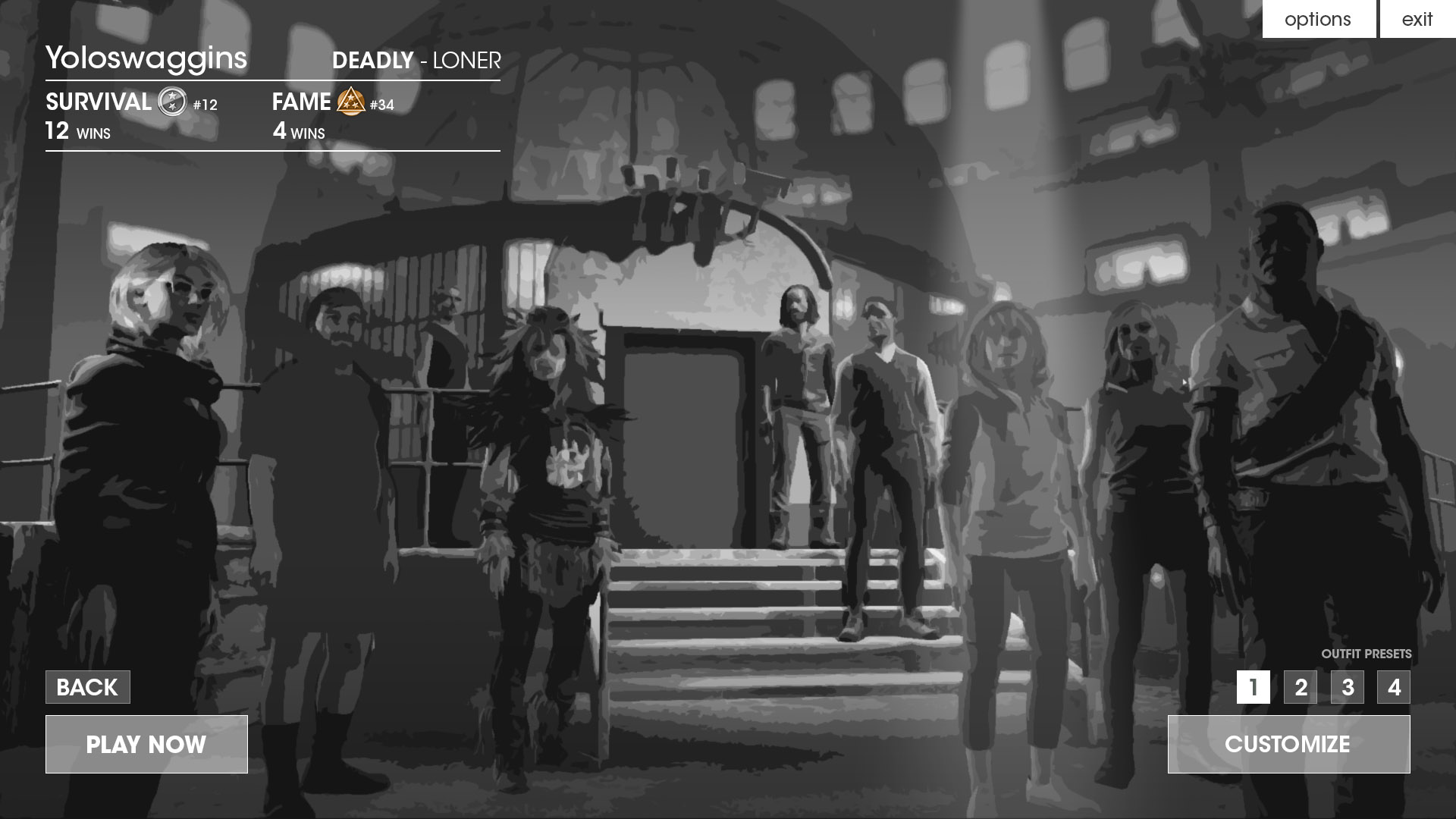
SOS EVOLVED : NEW BRANDING & STORY
After a year at Outpost, the game's story evolved and with it so did the branding. The game's fiction lost the hyper dystopian feel and Amarant was downplayed considerably to being nothing more than branding on in-game world props. The game was also no longer set in a fictional 1980's and with that lose the 80's aesthetics.
The story changed to evoking current reality TV shows such as The Amazing Race and Survivor. Players now played reality tv-show contestants competing in a gameshow rather than as prisoners to an evil overlord corporation.
We looked at contemporary reality tv-show intros and their aesthetics to pull from to create the new in-fiction TV show opening.

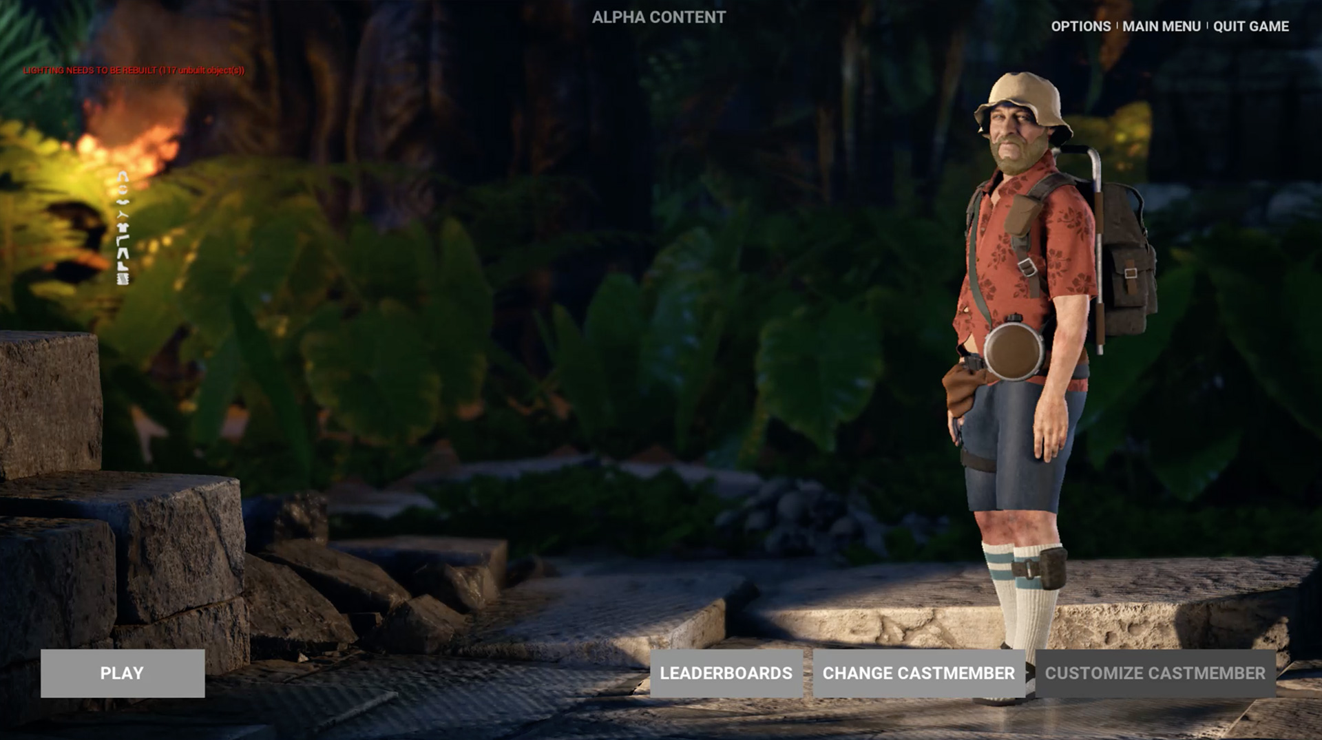
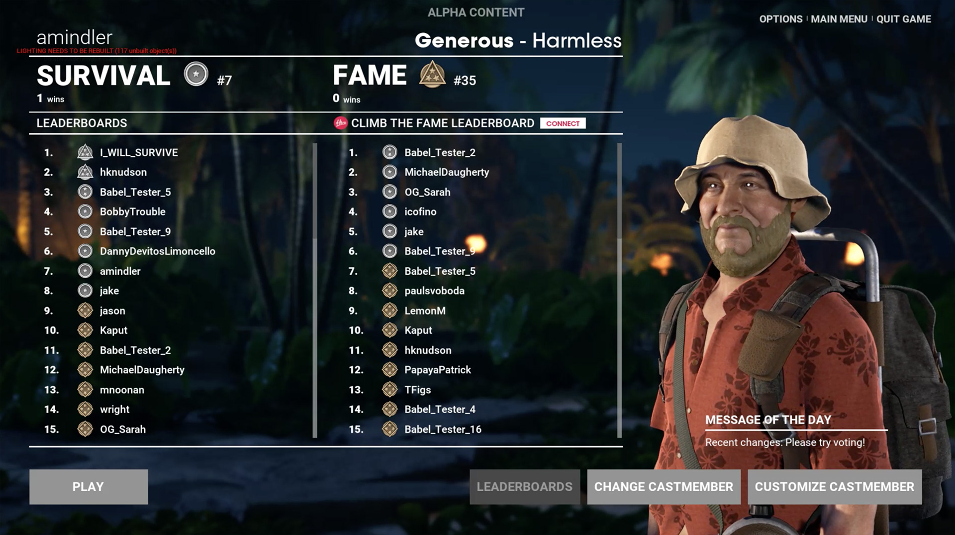
FULL GAME-SHOW CONCEPT
New background concepts created with Heather Knudson, an environment artist, to create the environments for the new menu screens.
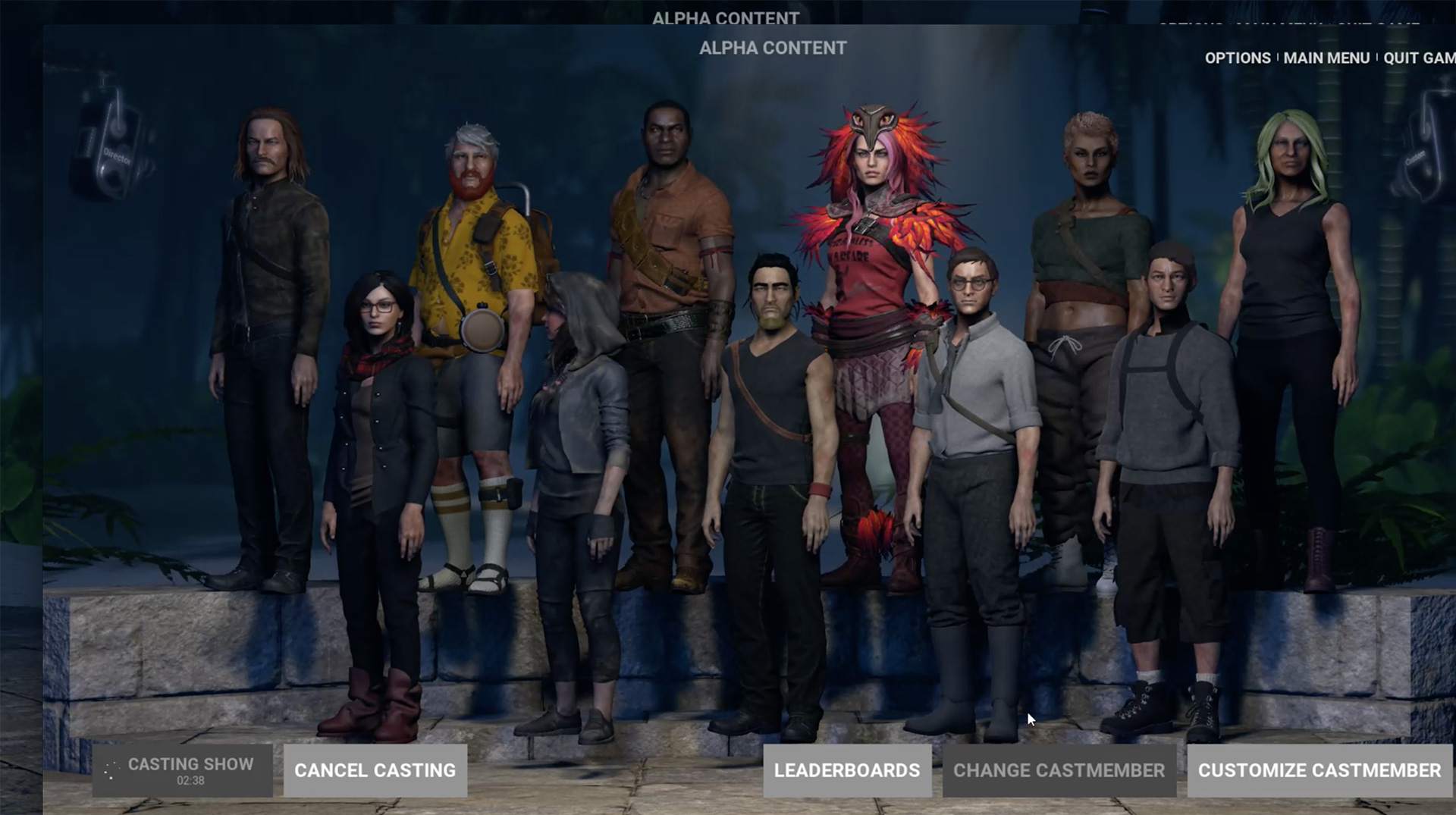
Final art in-game menu screens.
UI & UX
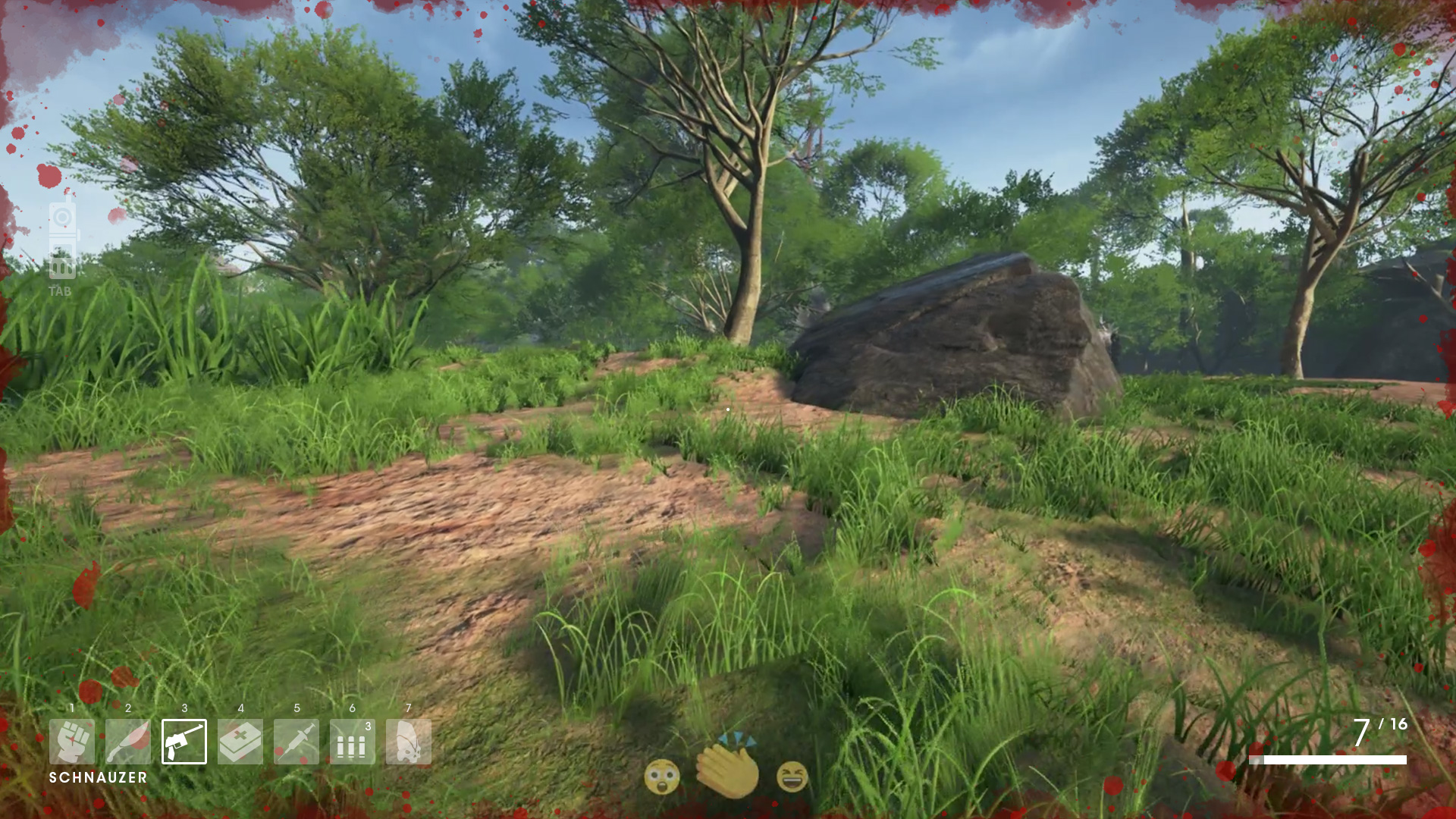
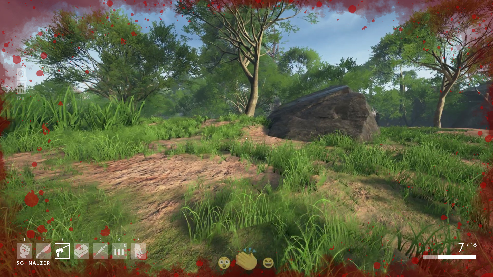
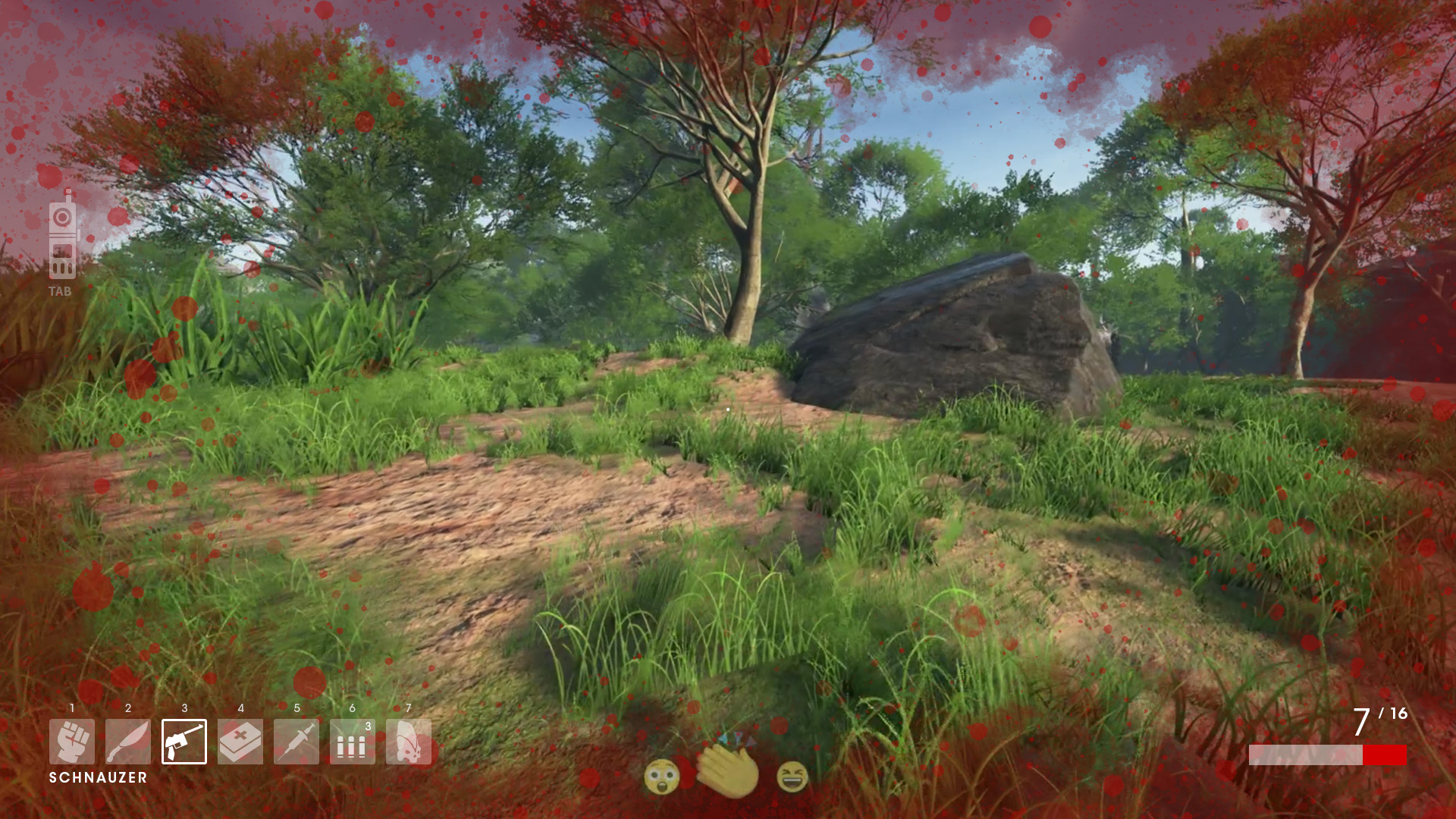
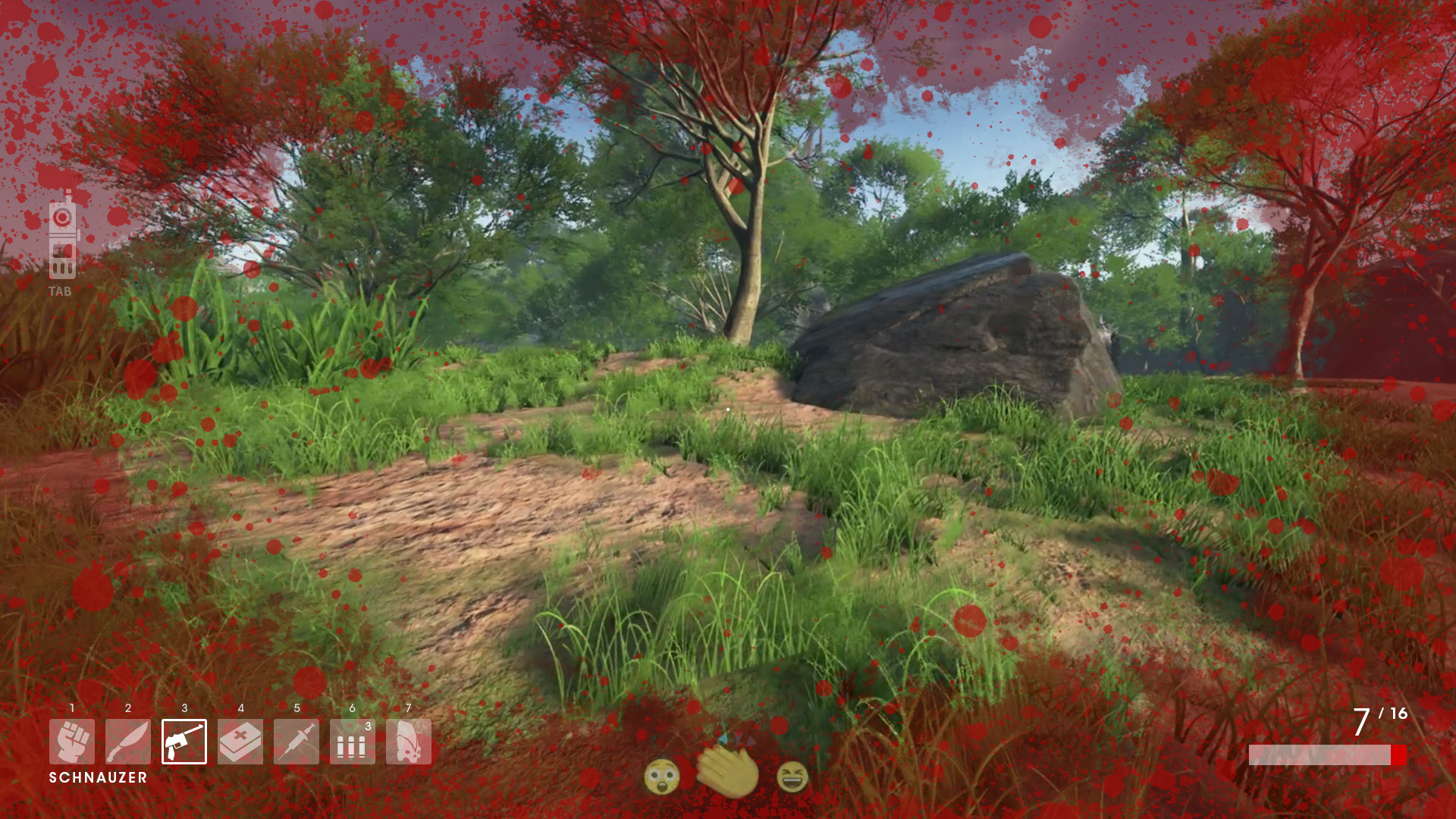
DAMAGE PROGRESSION
I created a series of mockups to show the on-screen damage indication and it's progression. From there moved into After Effects and created an animation of the different blood splatter creep, then converted the movie frames into a single black and white image which was used in game to create the final animated blood splatter creep effect.
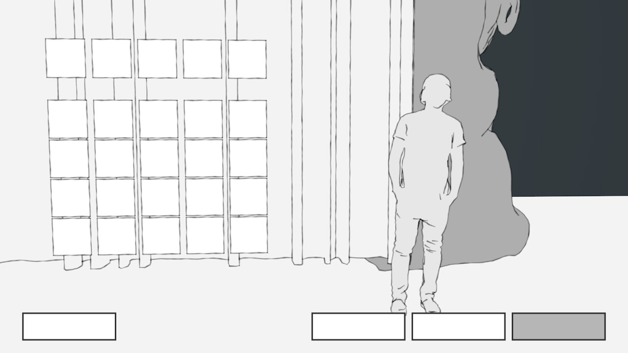
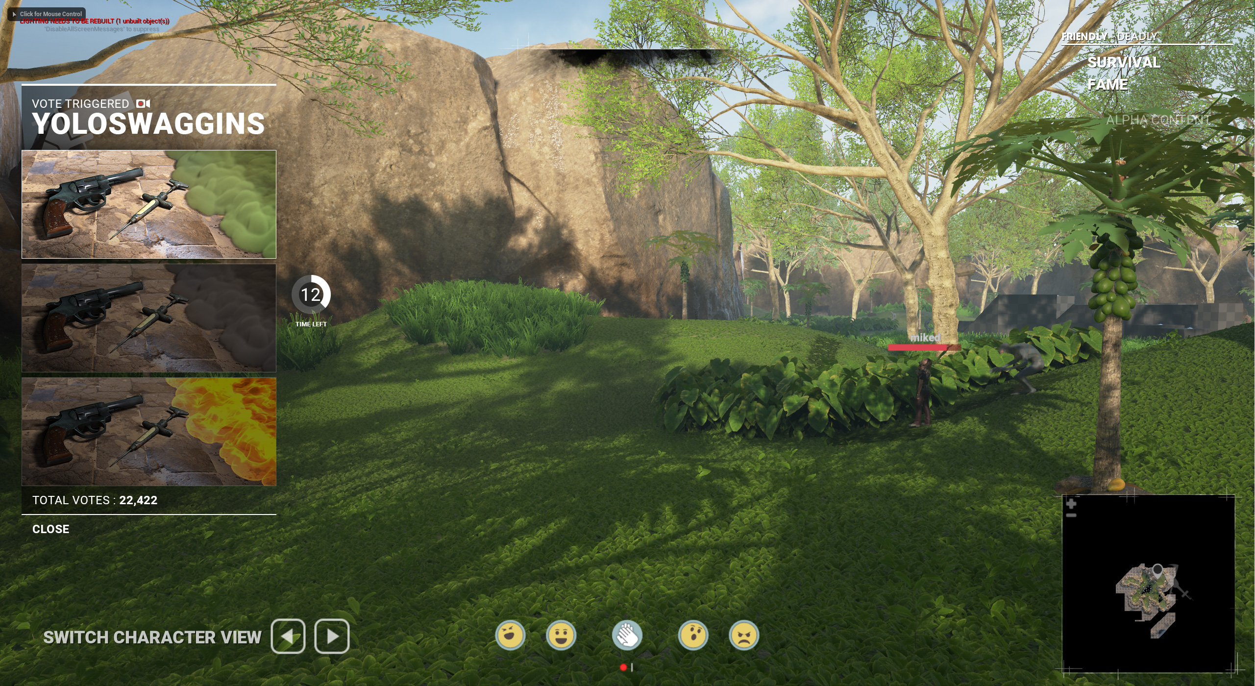
SPECTATOR VOTING WIREFRAME
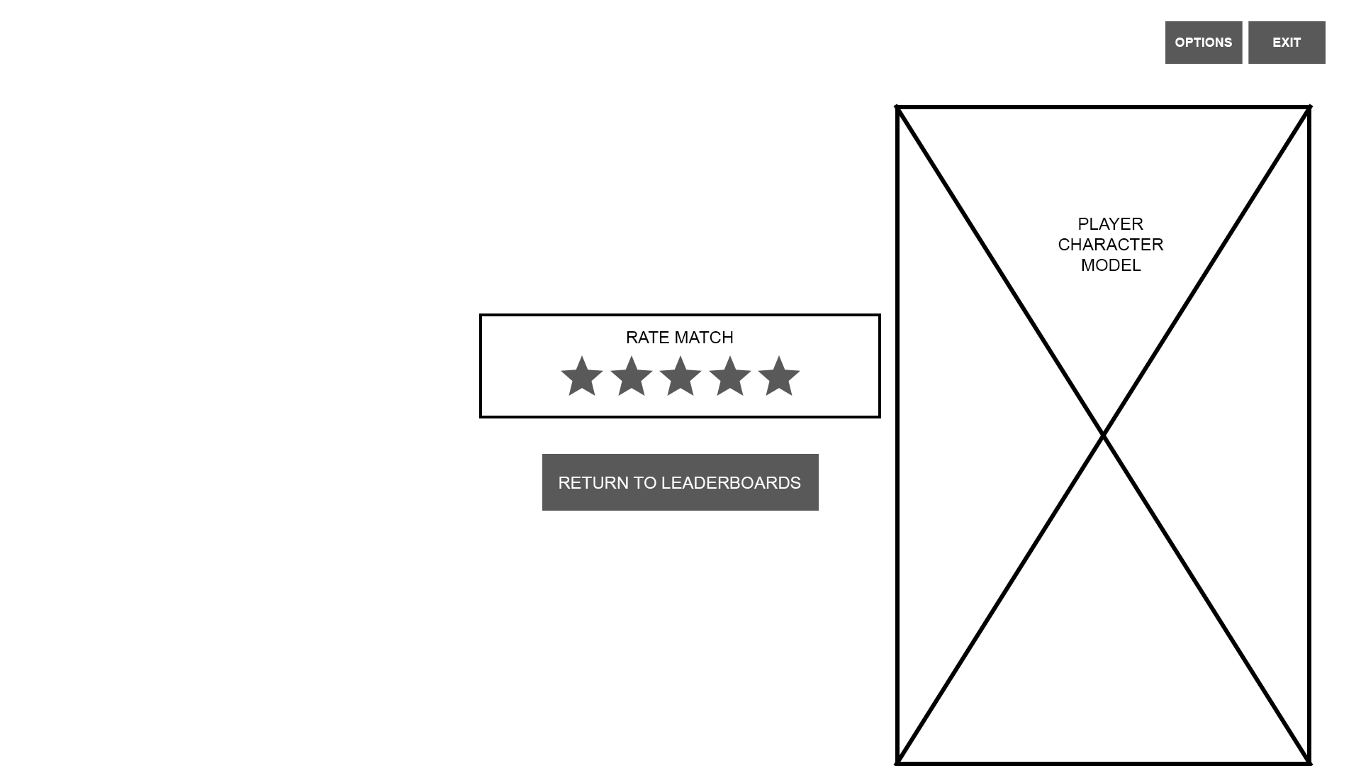
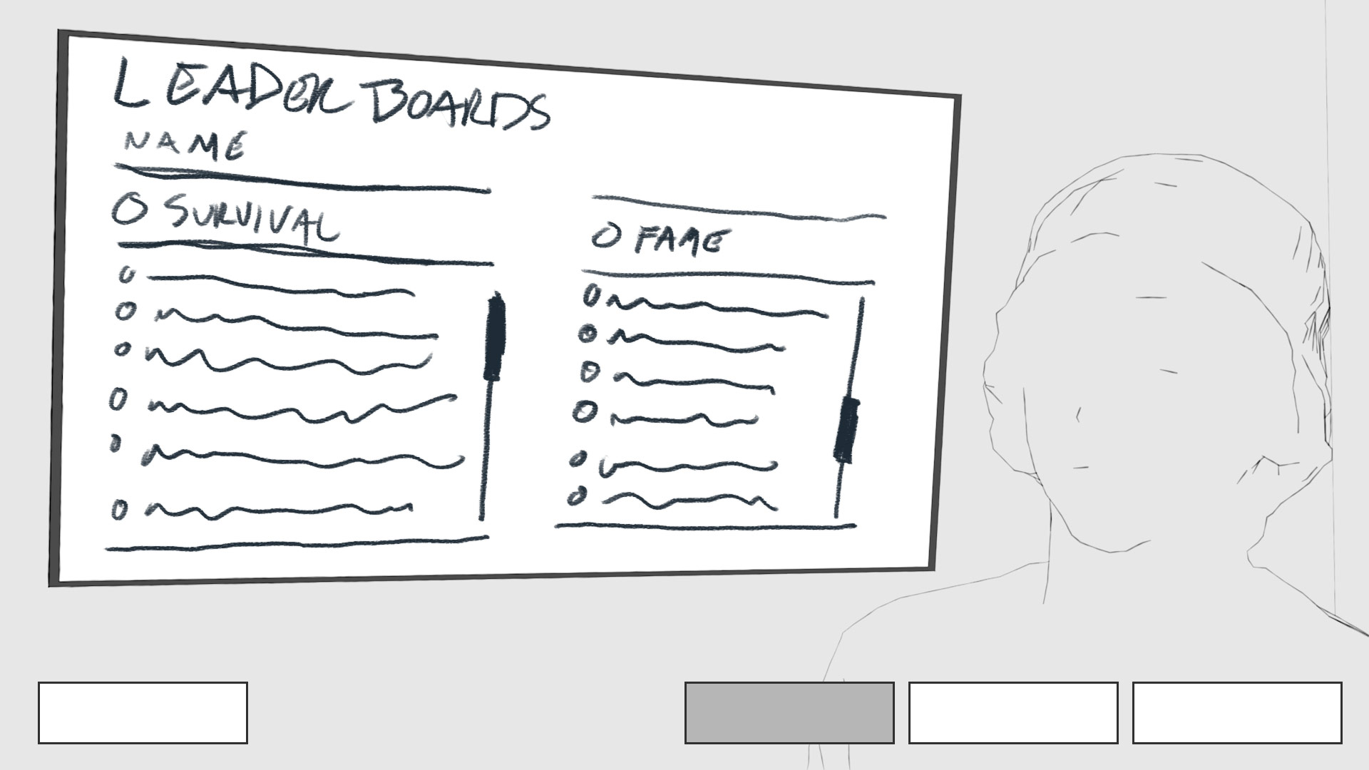
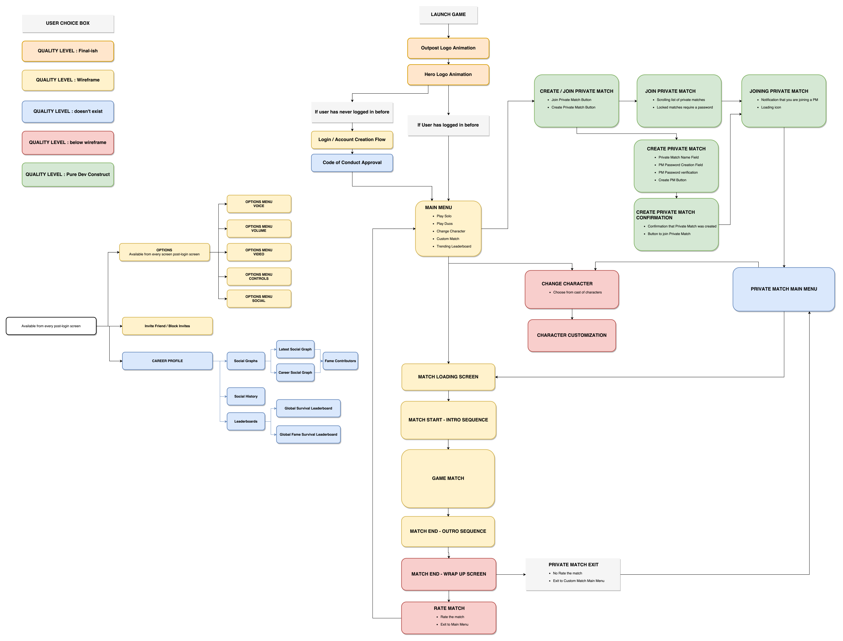
EARLY ACCESS RELEASE - UX FLOW MAP AND GAME EVALUATION
Projects
NBA2K21-22NBA2K UI Team
NBA2K17Game UI / UX
SOSGame UI / UX & Branding
NBA2K18Game UI
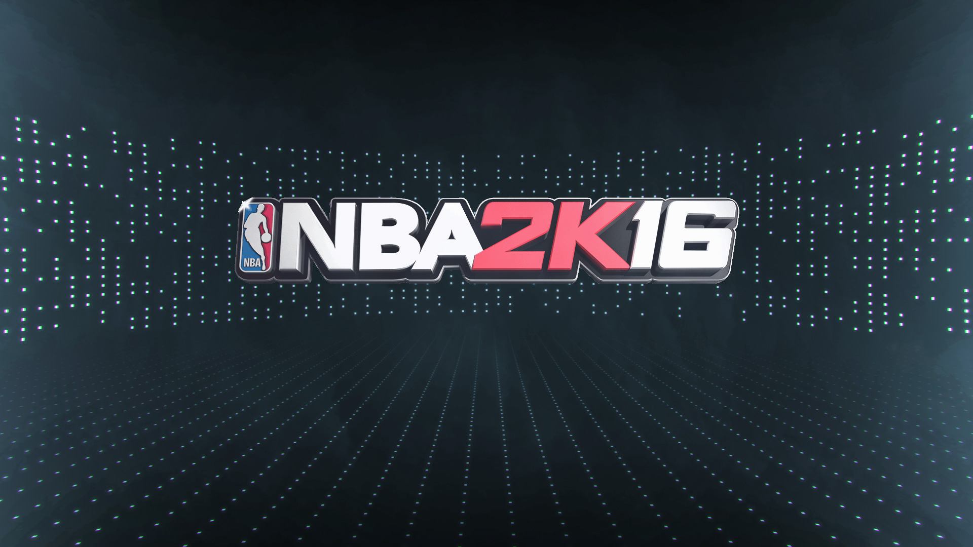
NBA2K16Game UI / UX
MotionGame Motion

Tower Defense GameGame Design
Sci-Fi Unity Personal ProjectsUI + UX + Game Design + Game Development