Proxy-Scavenger is a first person survival adventure game I worked on for a long while in my spare time that was about repairing broken down spaceships and recovering parts for money. The idea was that you'd explore randomly generated spaceship interiors and face environments with various issues such as excess heat or radiation and have to manage your survival and repair materials to adequately repair a ship or harvest working parts. You would then use the money earned to upgrade your ship, suit, tools, or buy spare parts to help with repairs.
Everything was placeholder as it was mostly about exploring mechanics and seeing if I could get things to work and if so, were they interesting or fun.
This is a Rogue-like RPG I originally created in 7 days, then spent an extra month on it dropping in some kit bashed art. It has a working inventory system, proc gen items / loot, skills / attacks, enemies with simple AI, and an experience and leveling system. The map is procedurally generated as well.
Over the years i've had the privaledge to work with a great group of people that we are collectively known as Radmars. All of our games can be played in browser and found at radmars.com
Some of the projects i've been able to contribute to are Grim Gateway, Micromancer, and Flesh Mess.
Below are some examples of work i've done for those projects!
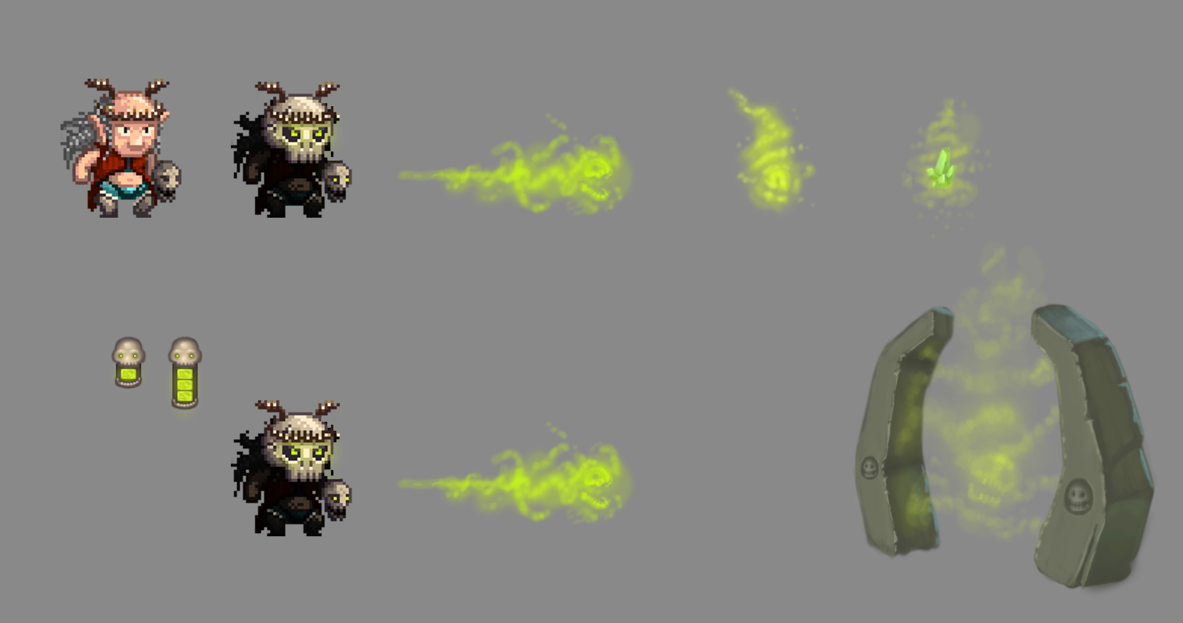
Here's a timelapse of my work on Grim Gateway showing off some of my contributions to the project which included concepts, pixel art, and pixel animation.
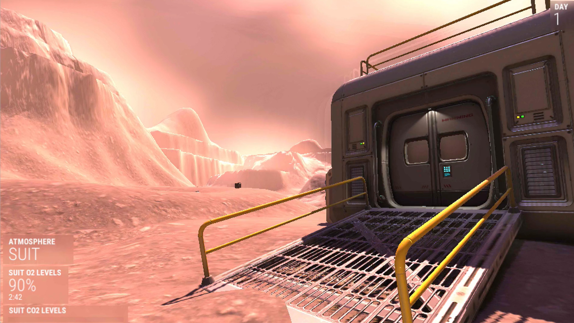
Surviving Mars is a first person exploration game built with Unity and available on itch.io to download and play. Surviving Mars was originally made for the 7 Day FPS itch.io game jam but then expanded over the course of two more weeks.
The project was largely a mix of kit-bashed 3D models and assets I repurposed from other projects. I was able to get the majority of the functionality stood up because of a lot of work I'd done on Proxy-Scavenger, a first person space ship repairer and exploration game I've been working on for a while now. I'll have another post outlining Proxy-Scavenger and it's various systems. I was able to code many new features thanks to having worked on Proxy-Scavenger as well.
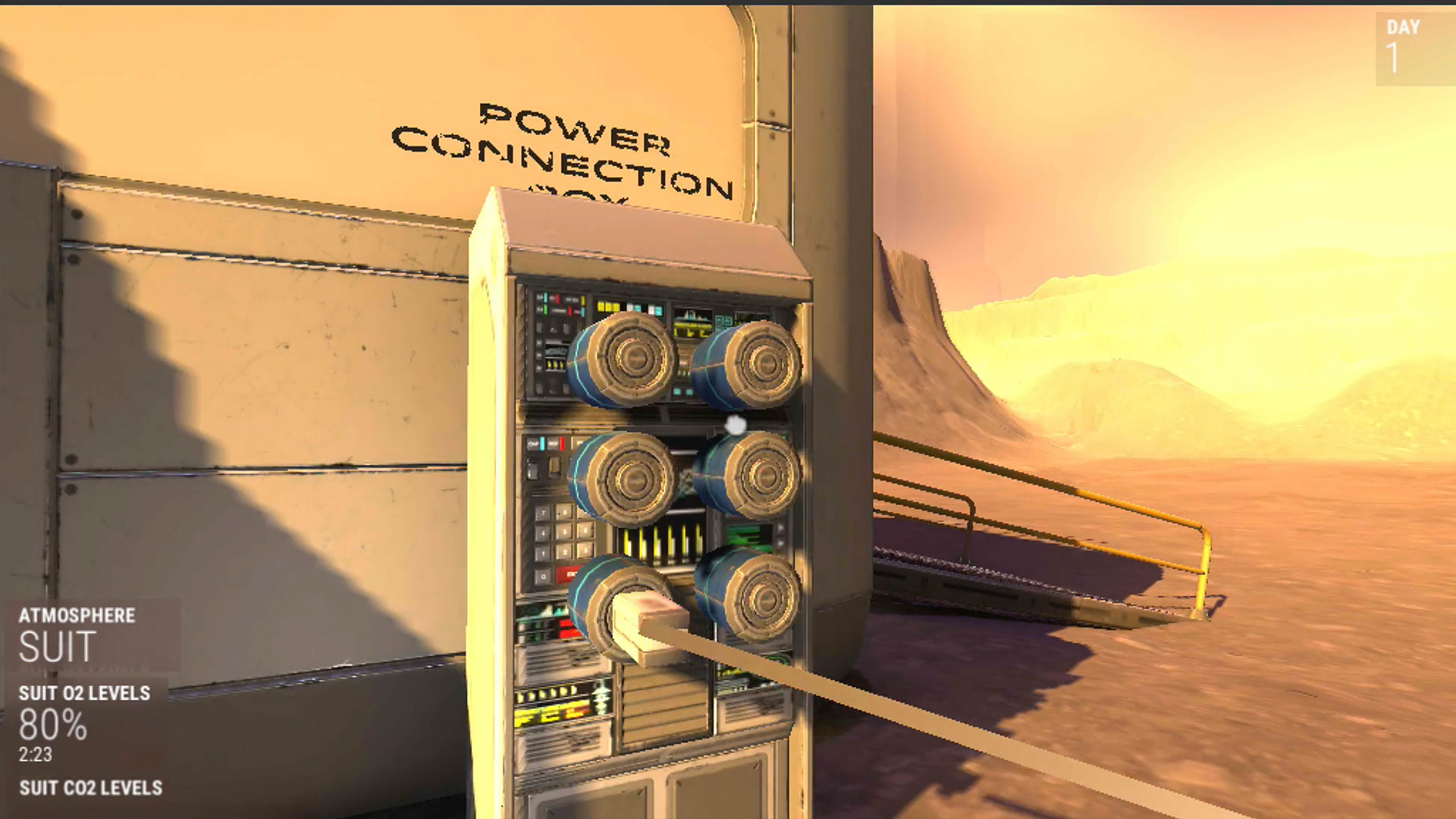
The original idea for the project was emulating the various difficulties of surviving in an alien environment with near future technology. I was inspired after watching the MARS short TV series. I was really interested in all the little things someone would have to worry about when living in a constructed home on an inhospitable world and going outside meant dealing with the limitations of a space suit.
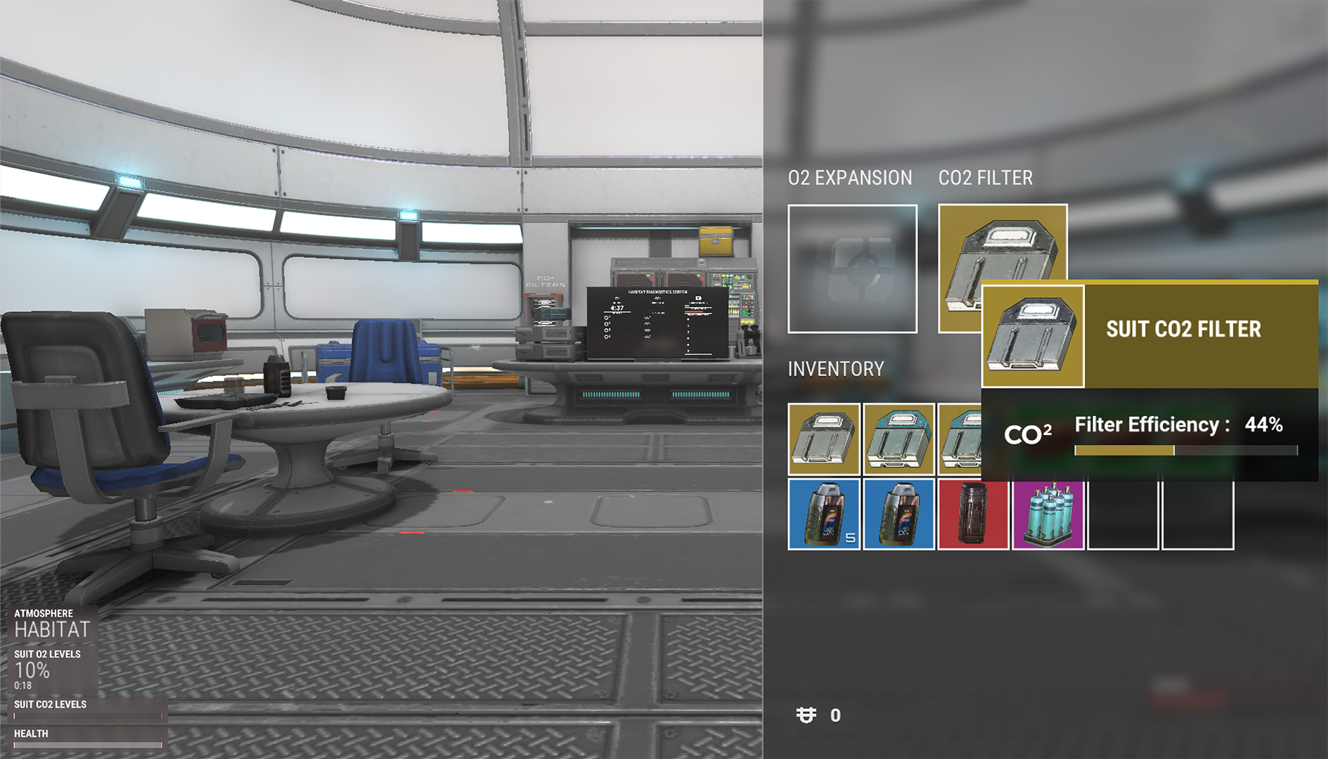
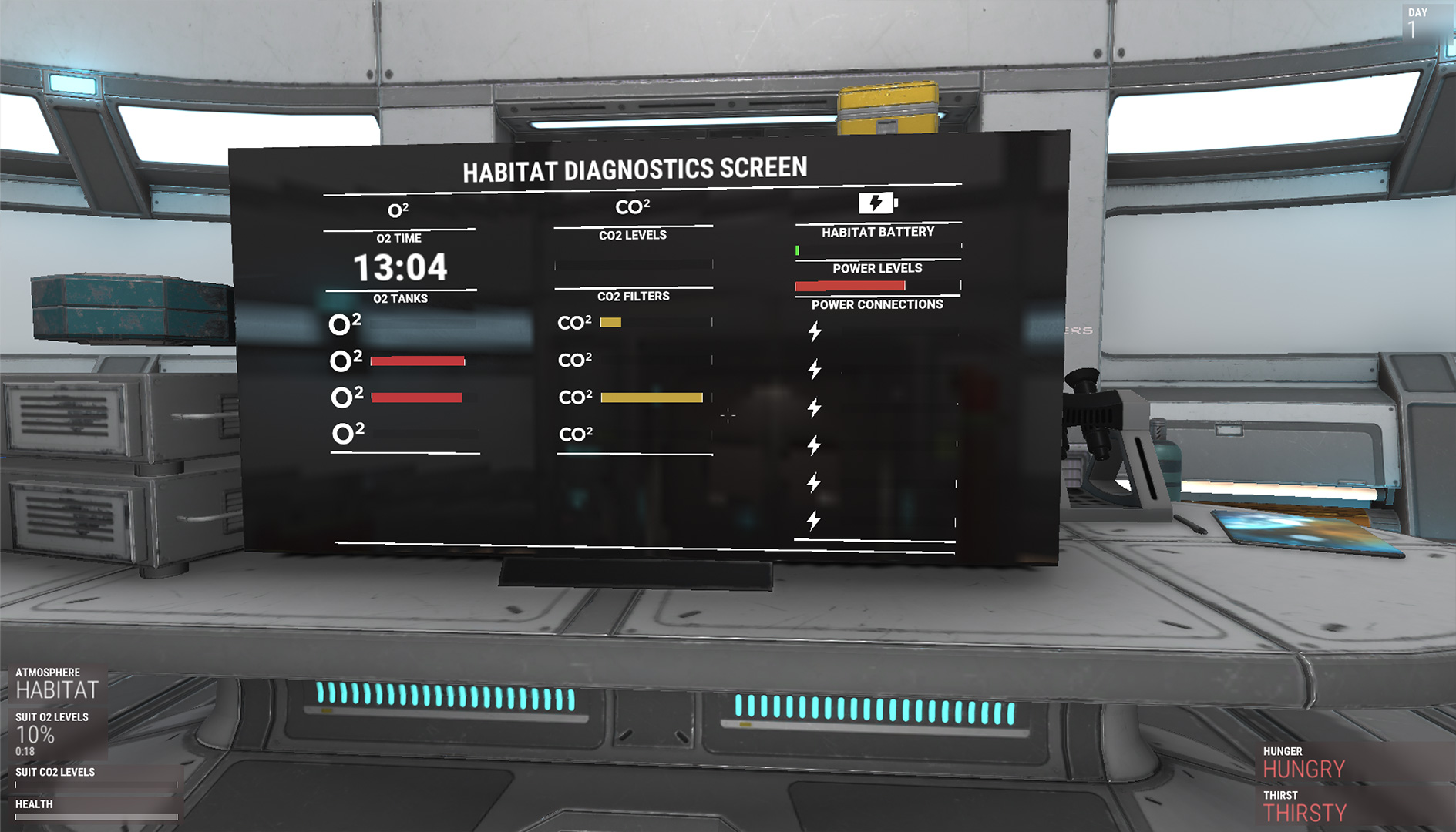
Originally during exploration you'd have to worry about suit oxygen, CO2 buildup and scrubbing, and suit power on top of managing your hunger, thirst, and fatigue. I did a lot of research to figure out realistic values for such things as how much oxygen humans generally consume idly as well as when exerting themselves, how much CO2 we generate, how many calories we burn etc. After playing it became apparent it would be fairly difficult to manage all of these aspects so I cut it down to dealing with your Oxygen, CO2 buildup / scrubbing, hunger, and thirst. I also played with the various 'real world' values to be less realistic, opting for better game feel and balance.
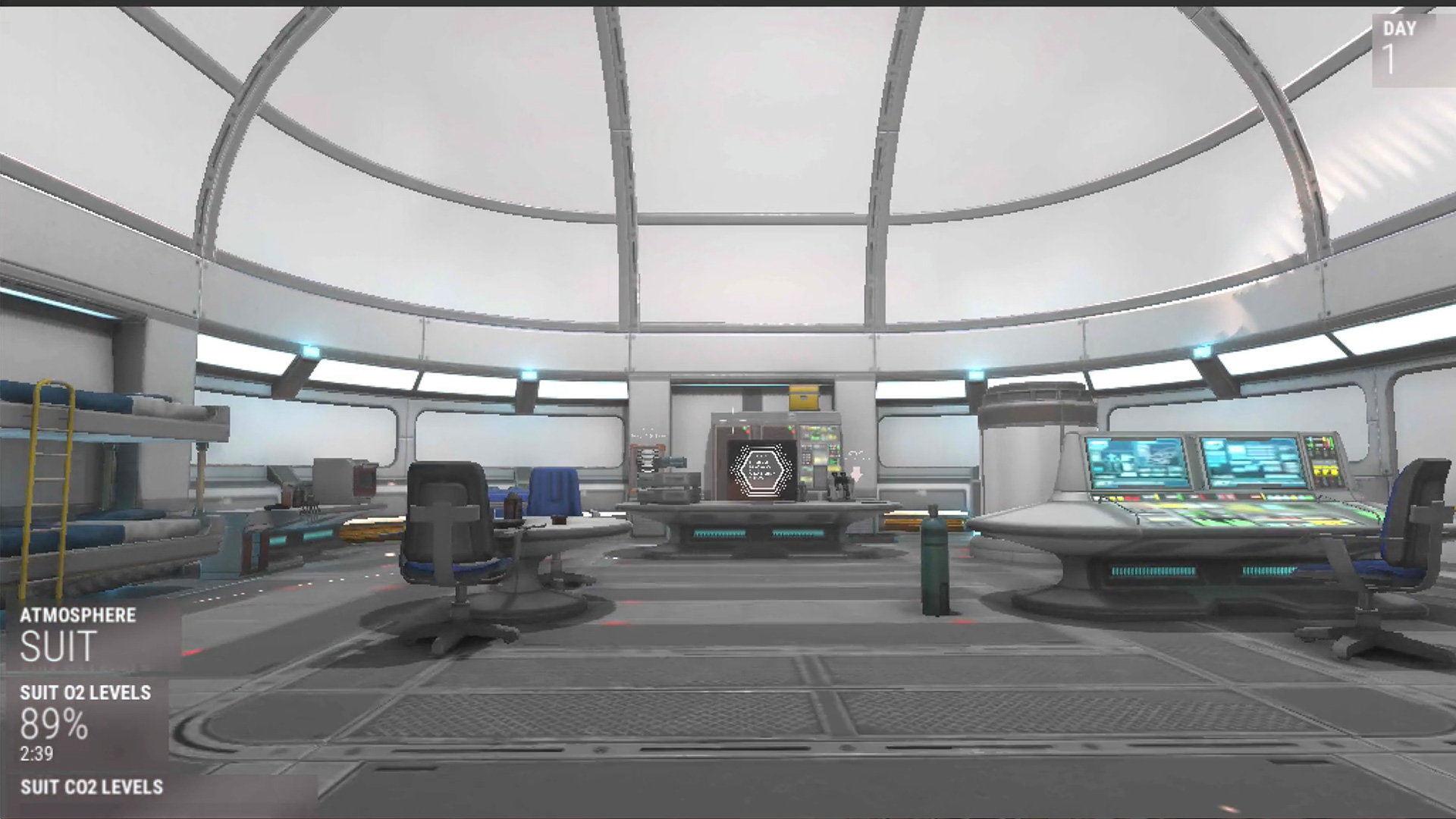
The habitat was another aspect I wanted to play with. I wanted you to have to deal with its power generation / battery power supply as well as oxygen and CO2 supplies. I had originally wanted to play with things such as the decay of your equipment and having to repair things that had either failed or broke due to random 'catastrophic' events. Unfortunately I ran out of time to work on the equipment failure events. The power supply and power generation was simplified to be simply connecting various power generation units to the habitat.
Power is currently a matter of a flat power consumption value and a starting battery level that drains. You overcome this by connecting various power generation units outside the habitat, either solar panels or nuclear reactors. Solar panels only generate power during the day and stop at night where as the nuclear power units continuously generate power. Connecting only 4 units will break even but anything over 4 will begin refilling the battery.
Originally I was going to have a system where you could conserve power by shutting down the various systems such as pumping oxygen, scrubbing CO2, and facility lights. Shutting down the oxygen pumps would mean you'd only have a limited time where you'd consume only the oxygen currently in the habitat and once back online it would refill. The CO2 would build up if the scrubbers were deactivated. By disabling various aspects of the habitat you could conserve power when you weren't inside the habitat or at night. I was also going to play with having to deal with entering and exiting an airlock and pumping in and out air. That was cut.
The habitat was simplified to managing tanks of O2 which gave a flat air volume to consume and the CO2 scrubbers are simply filters that you need to swap in and out as they are used up.
The win conditions are that you survive for 7 days then a rescue ship will land in the far corner of the map where you would win if you made it to the ship.
The game is punishingly difficult still and I have been tinkering with an update to help ease it up to make it a little more fun to explore.
The game can be downloaded and played from itch.io.


